If you don’t already know, as part of the solution, Nakisa's HR solution (formerly called Hanelly) provides a suite of powerful analytics tools that can help you make decisions about any number of things in your company. Included in the Hanelly tool kit is the ability to customize the view of the information the user has access to. This allows for total security of information within the solution, regardless of the user.
Some users have access to dashboards, Icicle, and Organization Overview charts, and multiple views of your org chart. Through these views, you have a lot of information at your fingertips.
This article describes some of those views, what they show, how they should be used, and how to access them.
Meet the Views
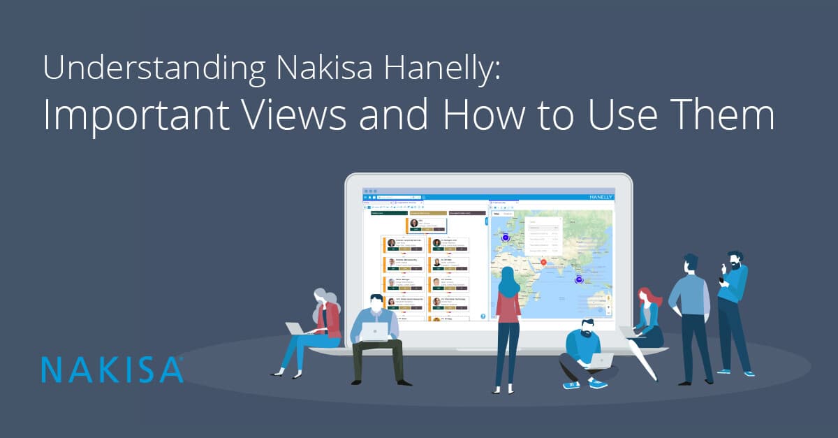
“View” is the term used in Hanelly to describe different layouts of the nodes on your org chart. A “node” is just one of the boxes on the chart, and they can represent positions, employees, or, in some environments, organizational units. Hanelly has several different versions of these display options, and users can slice and dice their data, depending on the tasks being performed. By default, the org chart view that is shown “out of the box” for Hanelly is called the Portrait view.

It works as a default for several reasons:
- It contains critical information about the position: the title, the location, and who holds it
- It contains a photo of the employee in that position (“So THAT’s Fred!)
- It does not contain any data that an Employee-level user is not allowed to see.
However, depending on your position and level, you may have access to private or secure information as part of your job. Examples are salary or tenure information, headcount data, and information about your company’s succession planning. To assist you with your tasks, Hanelly provides multiple views of your org chart with this information.
Talent Rating and Talent Rating Vertical
The Talent Rating and Talent Rating Vertical views contain the same information as the Portrait View, but with added icons. These icons represent each employee’s risk of loss, potential, performance, and whether the position is a key position or not. This view can be especially helpful for managers and HR when planning employee reductions in force and reorganizations. It puts key performance data right in the org chart for every employee.


Succession Plan/Successor View
When you prepare succession plans for the departure of employees, Hanelly has two views that can help. The Succession Plan view and the Successor View both contain information about the successor bench you have for some of the positions in your company. Hanelly uses successor data in your ERP and calculates the number of successors available for a given position and the subsequent bench strength.
The Successor View plan goes a step further and lists the top two successors for the position and their readiness to take over the new position. This helps you quickly see which employees should receive additional training or grooming to prepare for the new position.


Employee/Position Analytics
Finally, one of Hanelly’s most popular views is the Employee Analytics View. This view features 3 analytics directly on the node. You can change which analytics appear on the node with the three color-coded drop-down menus at the top of the screen.
The analytics you can choose from include (but are not limited to): headcount, span of control, and depth to see direct reports by manager and how many levels of management are in your organization. You can see salary details to ensure that departments do not exceed their budget goals, especially during reorganization. Even average age and gender demographics are available.

Accessing the Views
So now that you know these views are available, here’s where to find them:
- From your main org chart screen, click the menu with the 3 dots stacked on top of each other. (We call this the Action menu in the User Guide.) This opens a menu with 3 options in it: Chart Styles, Chart Perspective, and Chart Views.
- Chart Views. This expands a sub-menu for Position and Employee (and maybe Org Unit, if you are connected to an SAP ERP).
- The views described in this article are all Position views, so select Position. This expands the list of available views.
- Select the view you want.

Hanelly offers its users different ways to control and use the information in your system due to the level of information available. As a result, we have nested a lot of functionality behind menus and icons.
The main menu (looks like 3 straight lines), the action menu (3 dots), and the little icons running across the top of your org chart screen give you easy access to many features and display options. They allow you to change the information you see in Hanelly and work with what you need.
The power of the views in Hanelly is in the control, based on the user, and the details available. Understanding the views and taking advantage of the information available to you in those views can be a real time saver.
Now that you know how, next time you log in to Nakisa Hanelly, take some time to play around and explore your options with the user menus to see which view best suits your individual needs. There’s a wealth of information waiting for you to explore, just a few clicks away.
Check out our full blog page for other detailed Hanelly user blogs to help guide your user experience, as well as HR Tech topic expertise.

