
A bit of history
It’s an old story, but worth repeating. Once upon a time, we were an on-premises company, shipping software through traditional means. Then came the move to the cloud, an exciting period filled with learning and transformation, about a decade ago.
Now, we are undergoing a major AI-first transformation.
Two years ago, we embarked on this journey. There was a lot to learn, a lot of fascinating technology to explore, and many opportunities to push our imagination of what’s possible and valuable.
Where we are today
Fast forward to today, we’re finally at a stage where we can start sharing tangible outcomes. The progress came from experimentation, learning, making mistakes, and continuously improving.
One of the most exciting developments I want to highlight is a tool we’ve been building in Nakisa Labs, the Nakisa Decision Intelligence (NDI) Platform. It has graduated and is ready for production.
I’ve been using the early access for the past weeks, and I’m deeply impressed with what it can already do, and even more excited about the potential it brings.
Unlocking data insights with Nakisa AI
In a nutshell:
- It connects to a dataset.
- I can ask natural language questions.
- The system generates meaningful, valuable answers in return.
This is just the tip of the iceberg. The system doesn’t just handle data; it handles large-scale data while understanding user intent and surfacing relevant insights.
Here are some sample questions and answers shown in images.
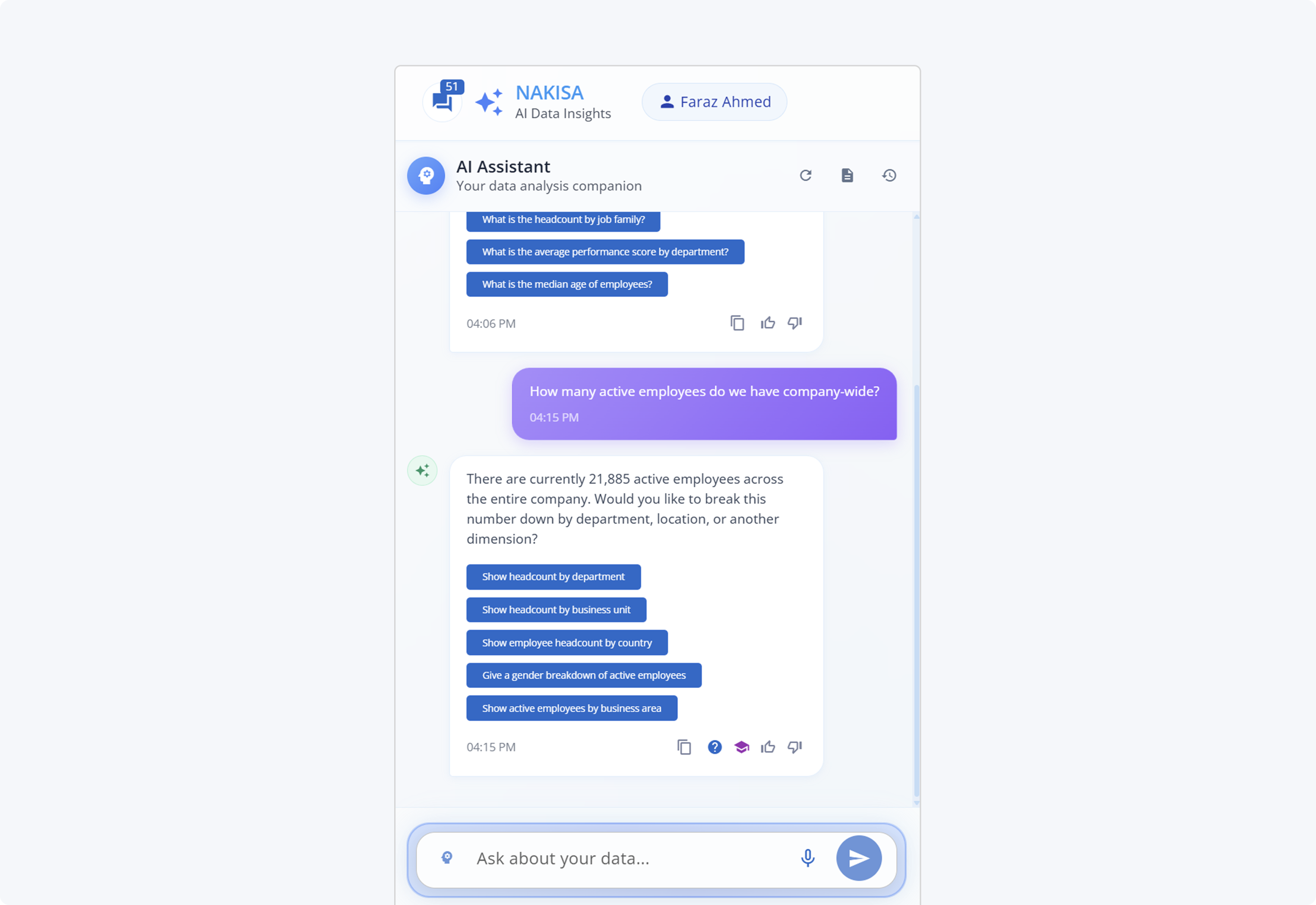
How many active employees do we have company-wide?
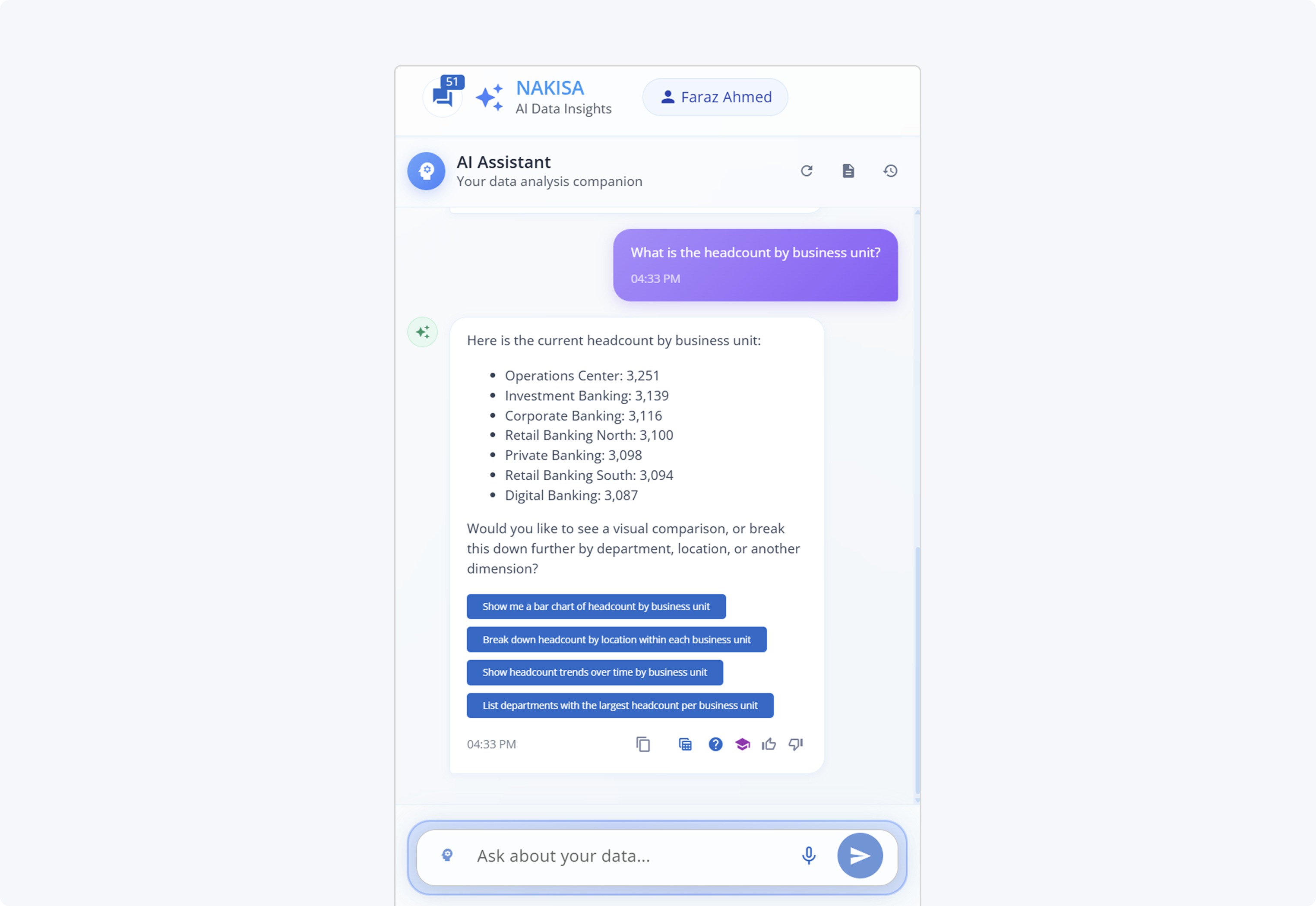
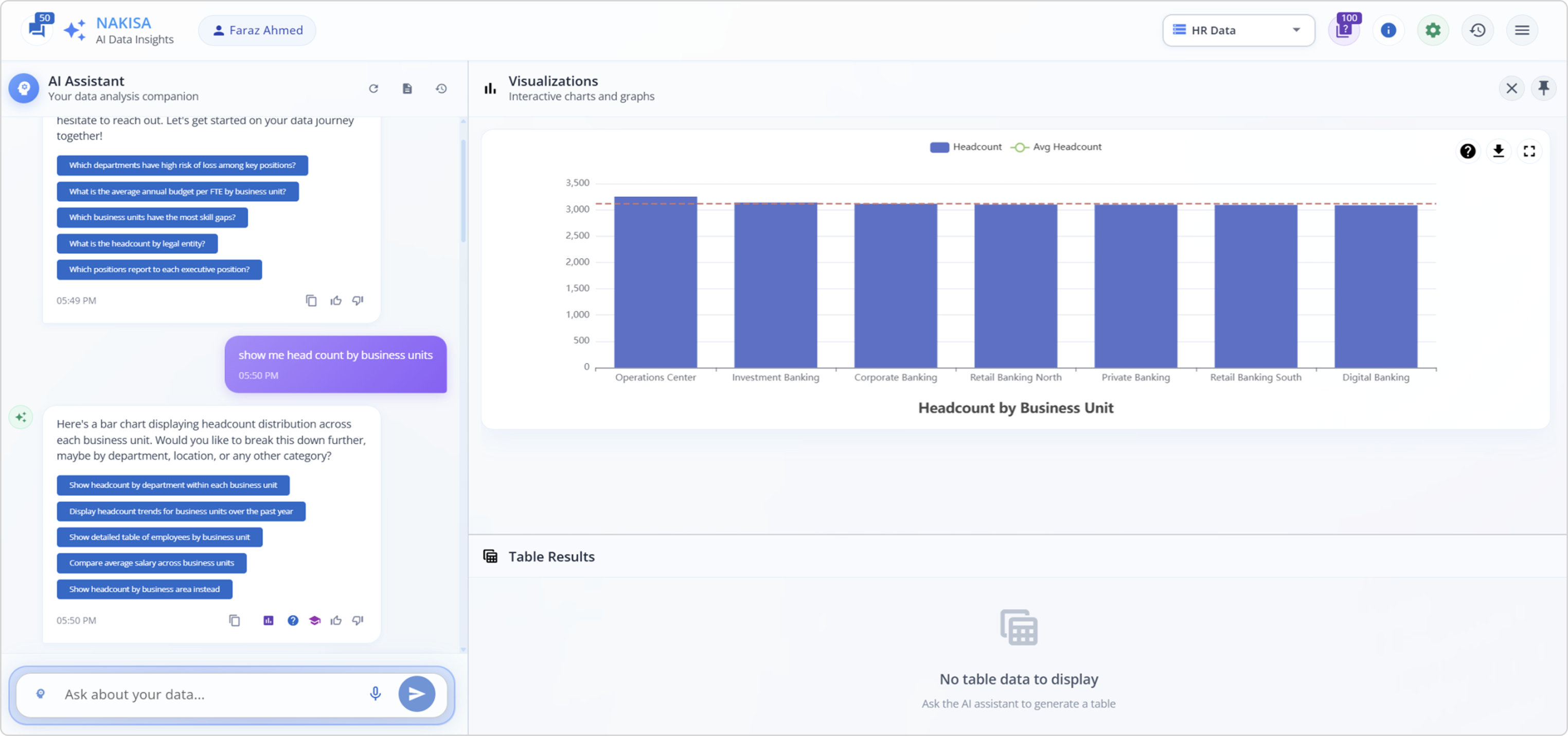
What is the headcount by business unit?
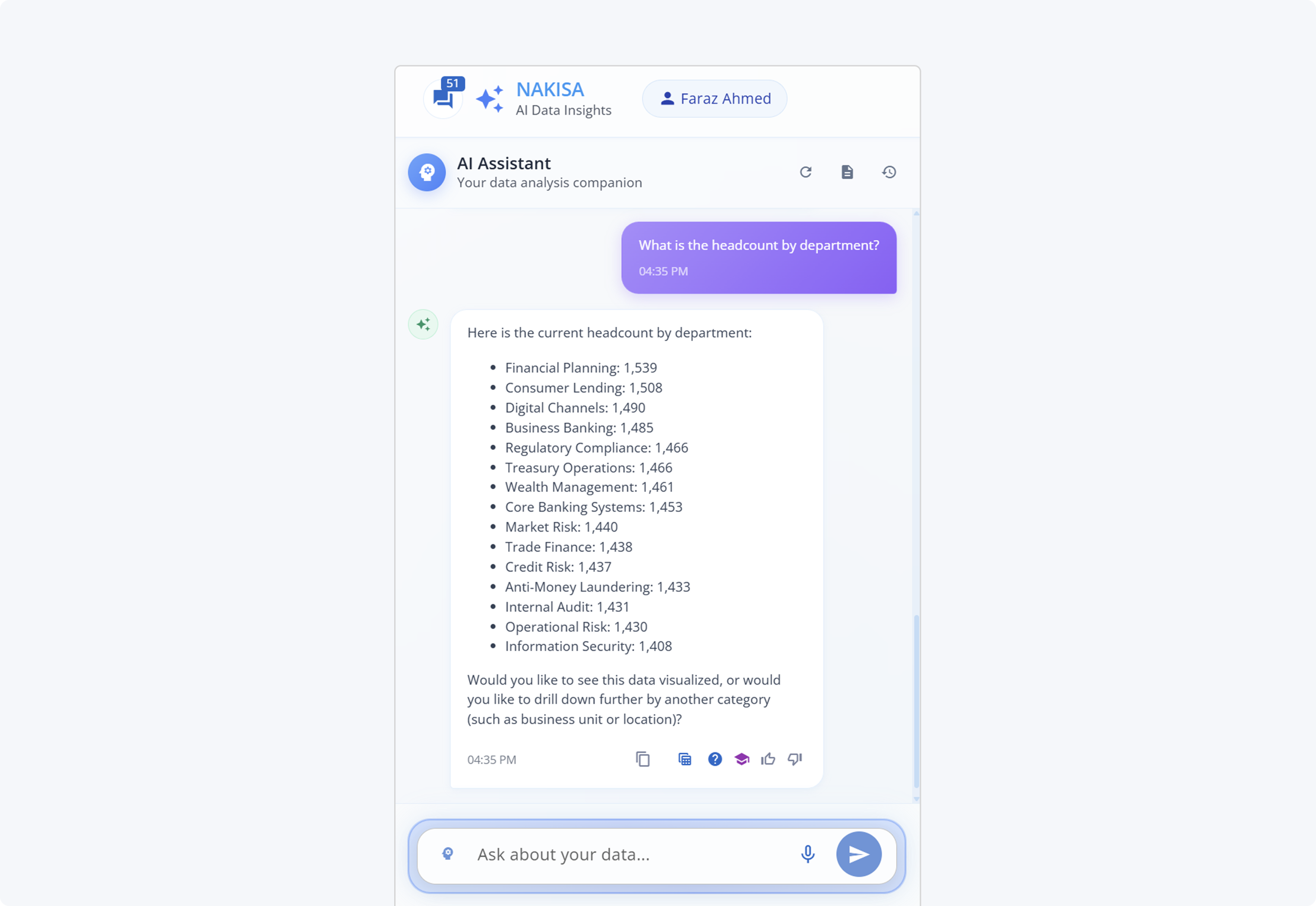
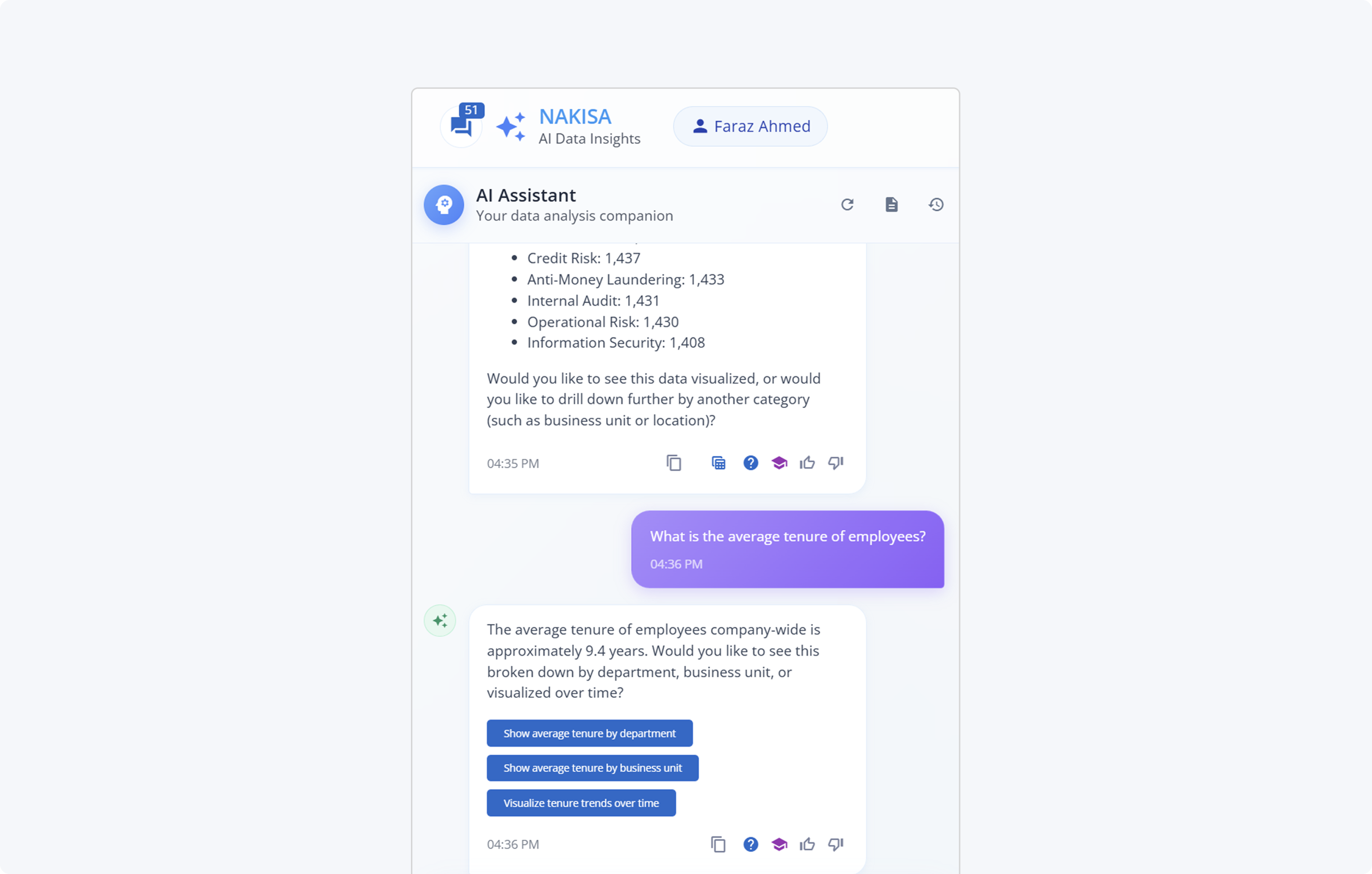
What is the headcount by department?
What is the average tenure of employees?
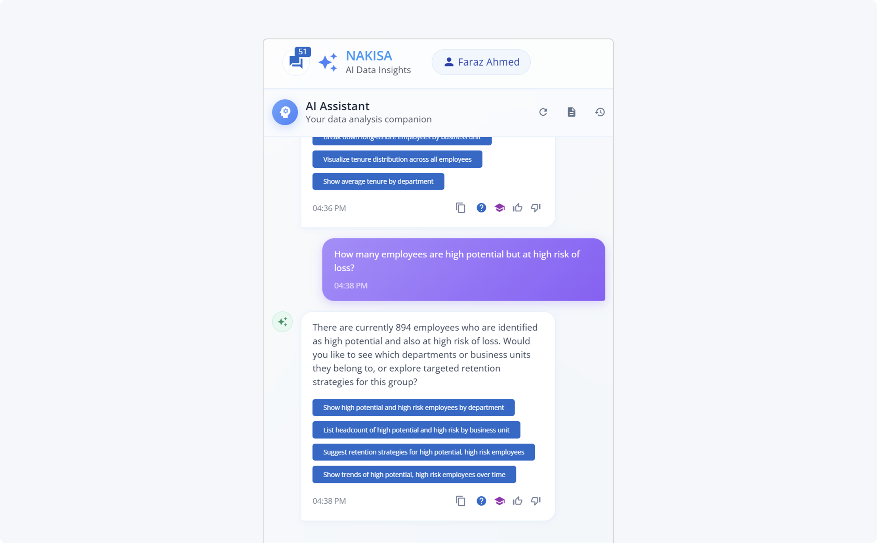
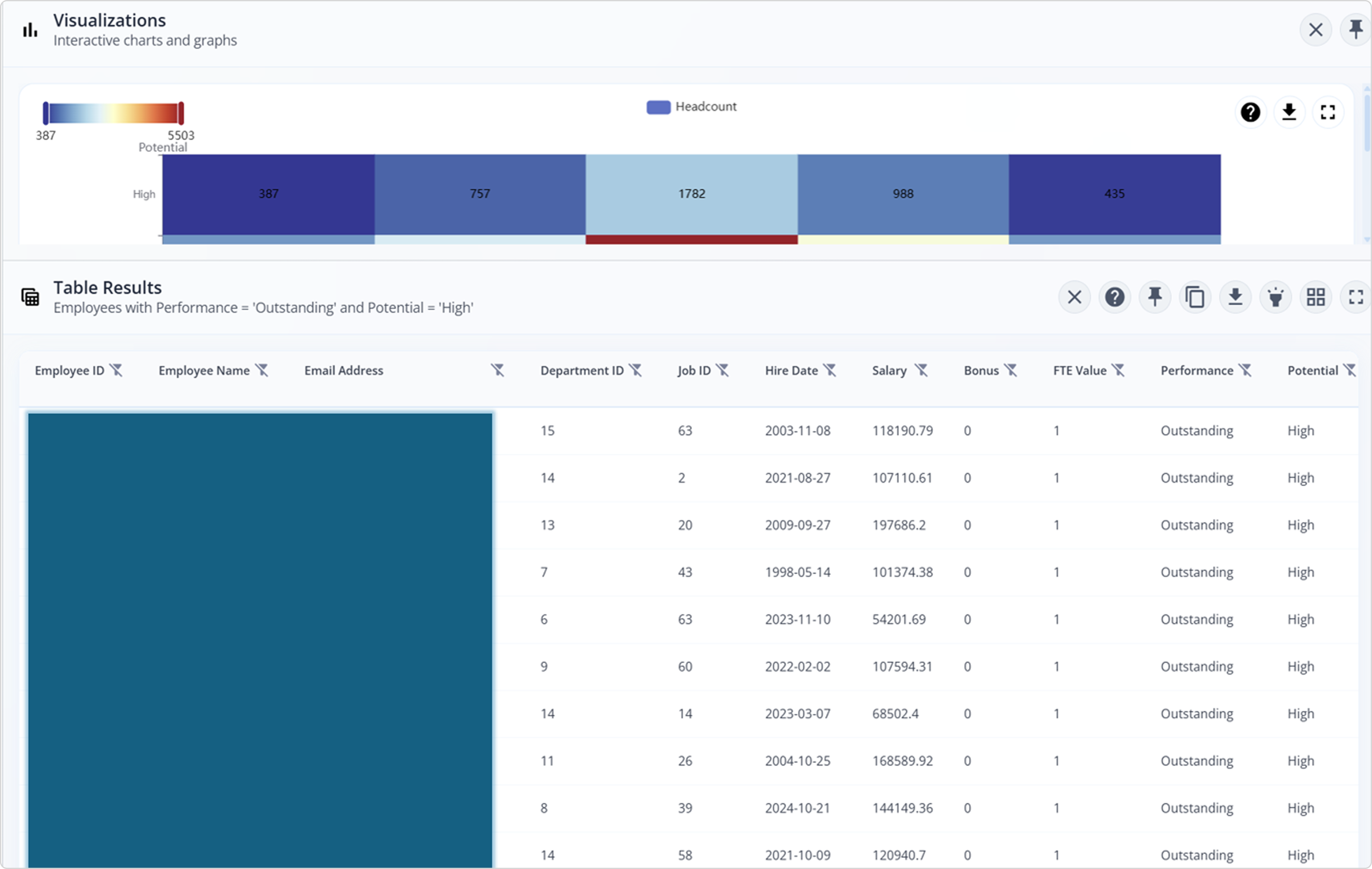
How many employees are high-potential but at high risk of loss?
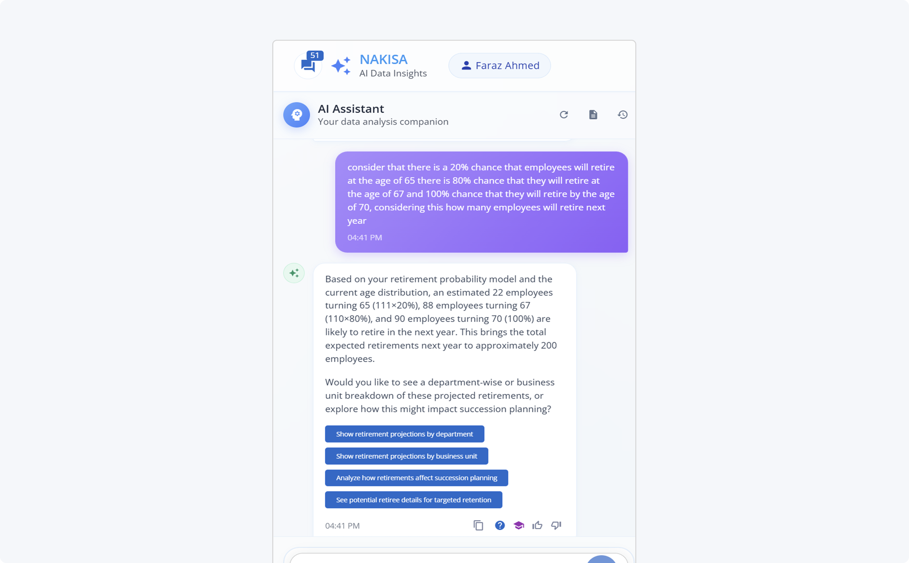
Consider that there is a 20% chance that employees will retire at the age of 65, there is an 80% chance that they will retire at the age of 67, and a 100% chance that they will retire by the age of 70. Considering this, how many employees will retire next year?
... and have you noticed those follow-ups in blue? more to show next.
From natural language to live visualizations
A natural next step is visualization. Data becomes far more powerful when translated into intuitive charts and graphs that reveal patterns at a glance.
I’m excited to share how Nakisa Decision Intelligence not only responds in natural language but also renders live, interactive visualizations, bringing deeper meaning to your data in real time.
Why this matters
- No pre-training required: Setting up Nakisa AI does not demand extensive preparation or technical expertise.
- Truly agentic and generative: The system transforms simple questions into deep discoveries, surfacing insights that would otherwise remain hidden within your data.
- From insight to impact: By pairing narrative insights with visual outcomes, users can move from exploration to decision-making faster than ever.
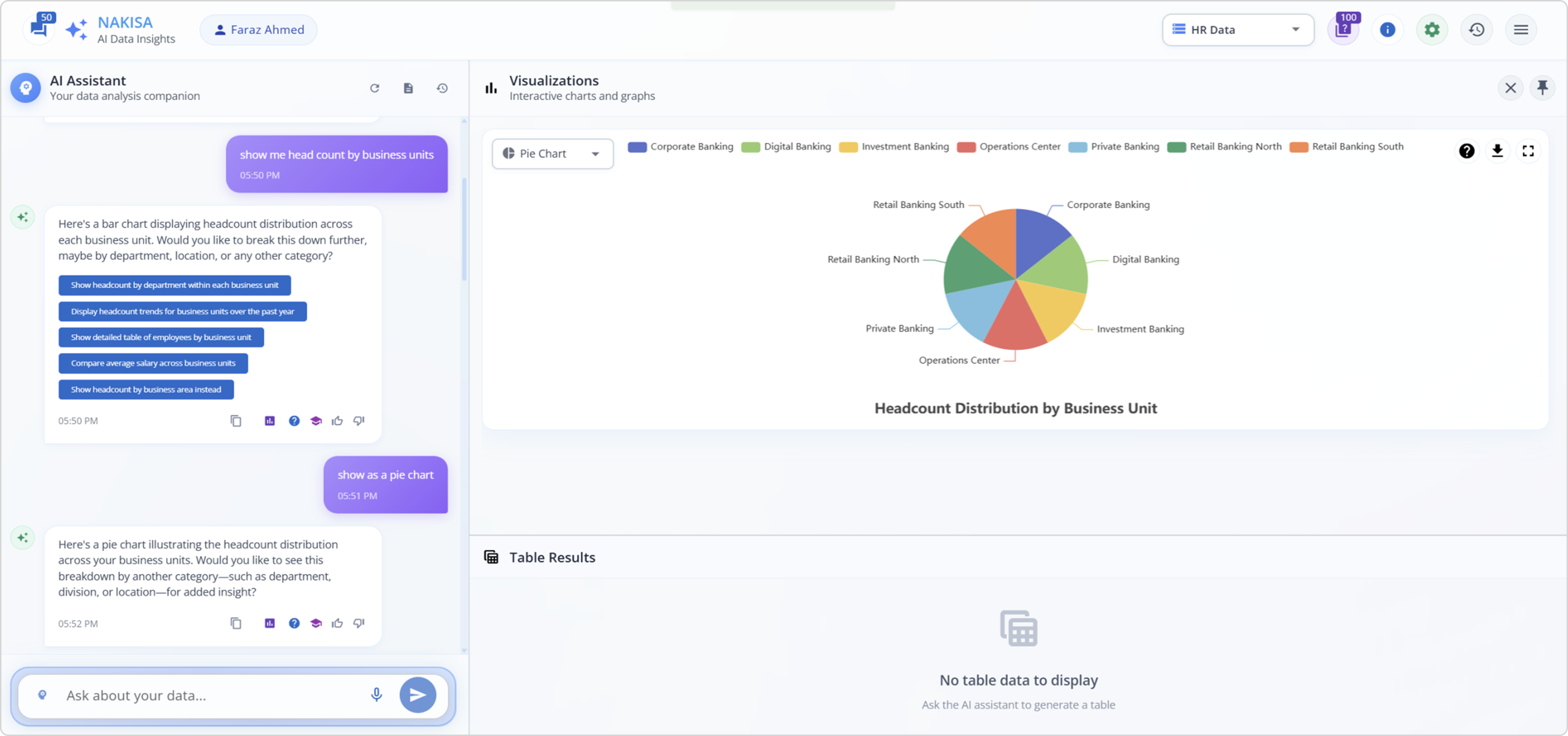
Here’s a series of questions I asked NDI using a dataset that includes HR data.
Show me the headcount by business units.
Show as a pie chart.
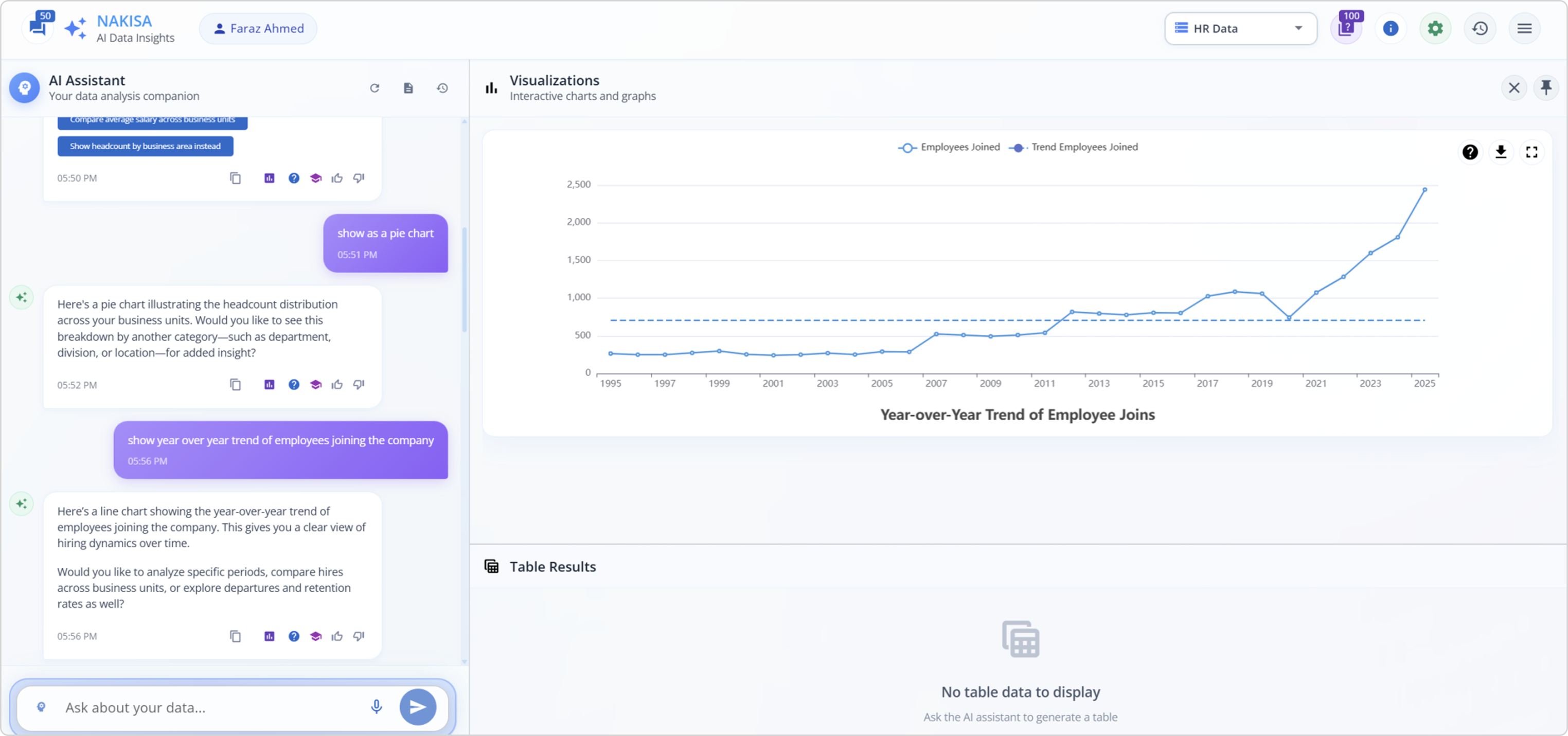
Show the year-over-year trend of employees joining the company.
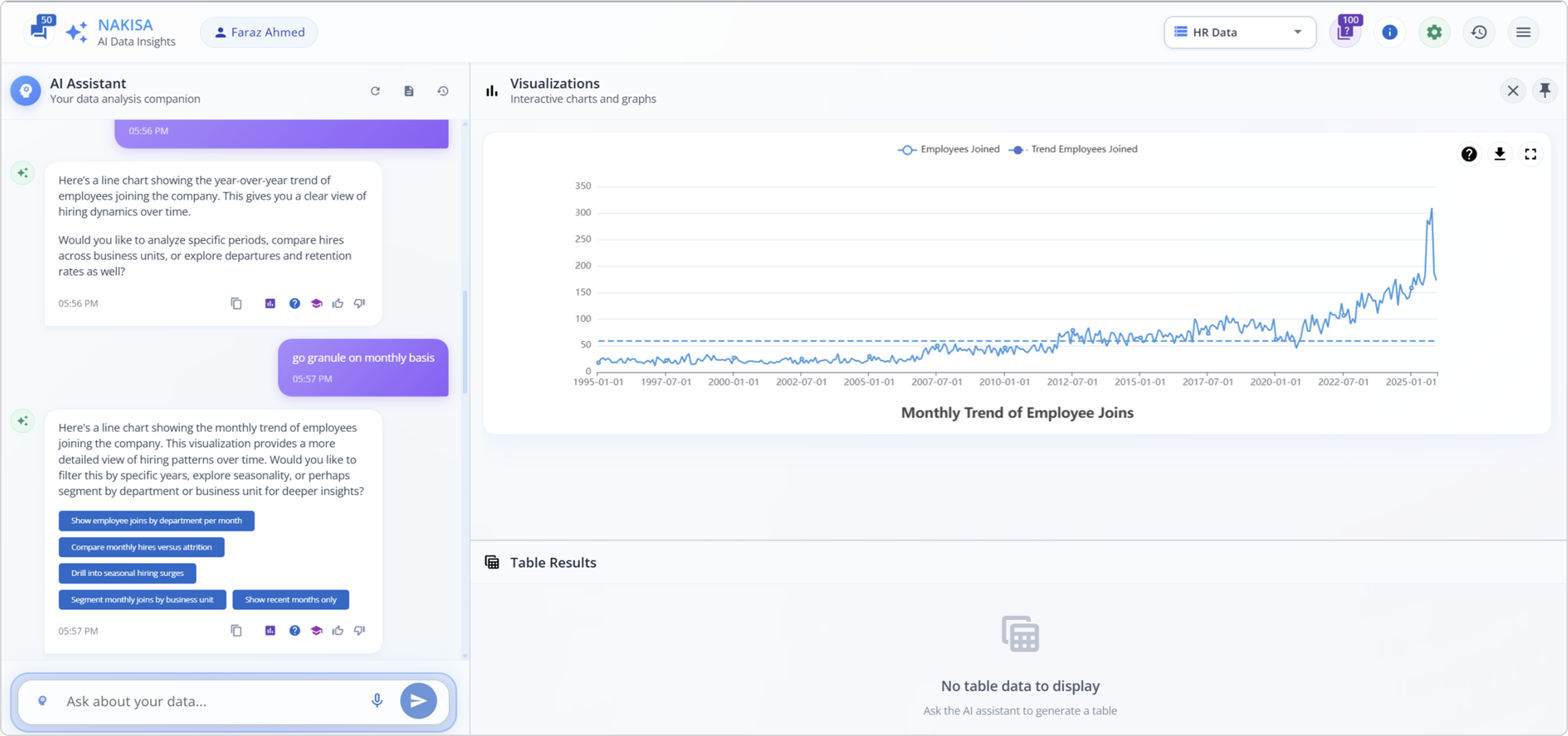
Then I asked:
Go granule on a monthly basis.
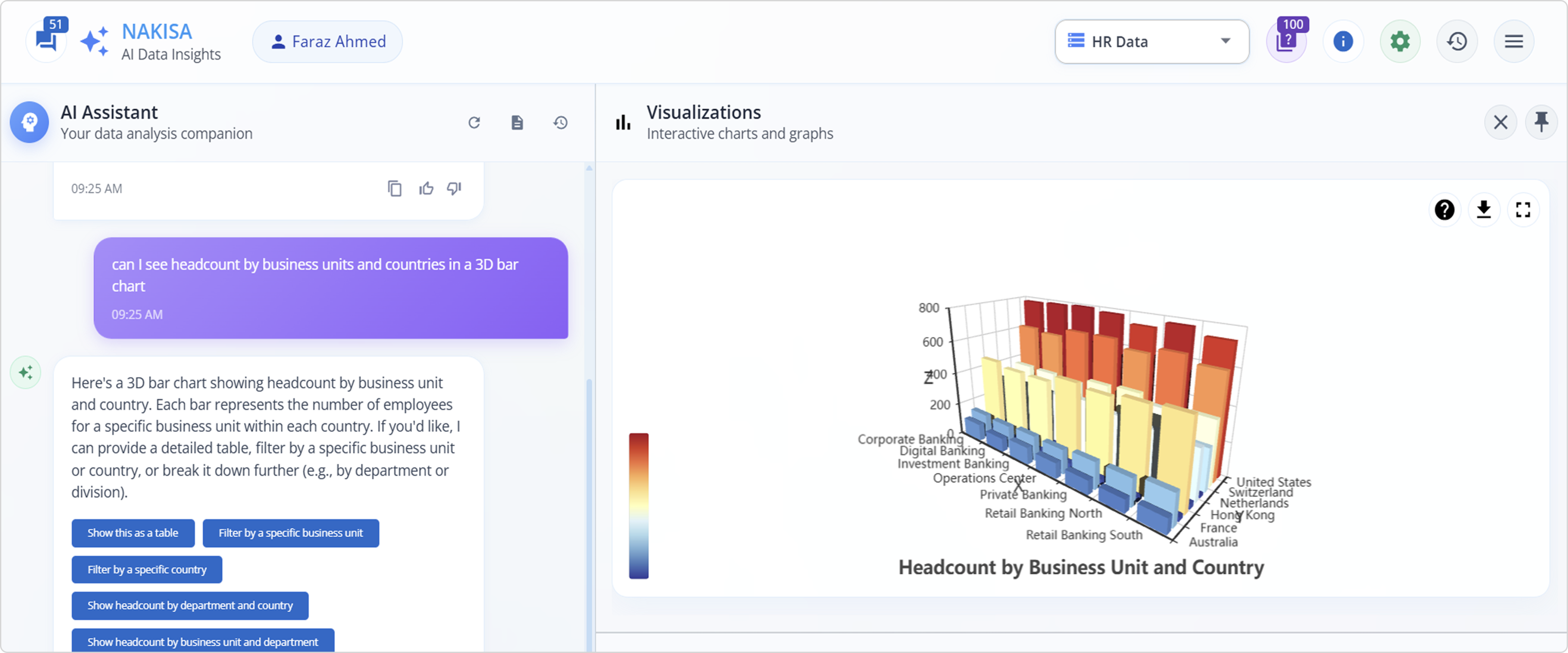
I can be more specific about visualization:
Can I see the headcount by business units and countries in a 3D bar chart?
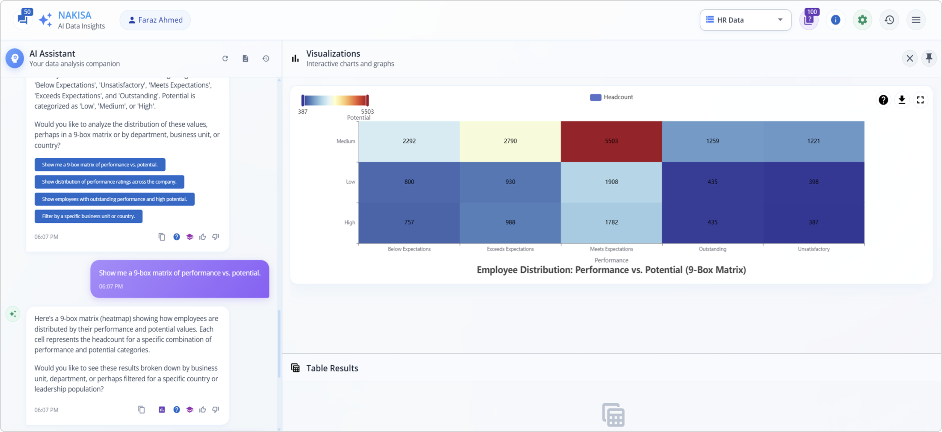
Do we have employee performance and potential values?
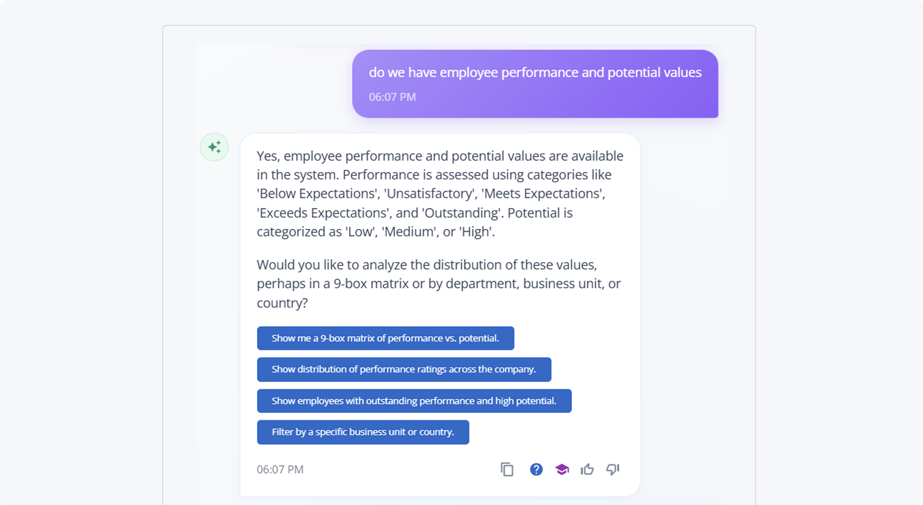
Show me a 9-box matrix of performance vs. potential.
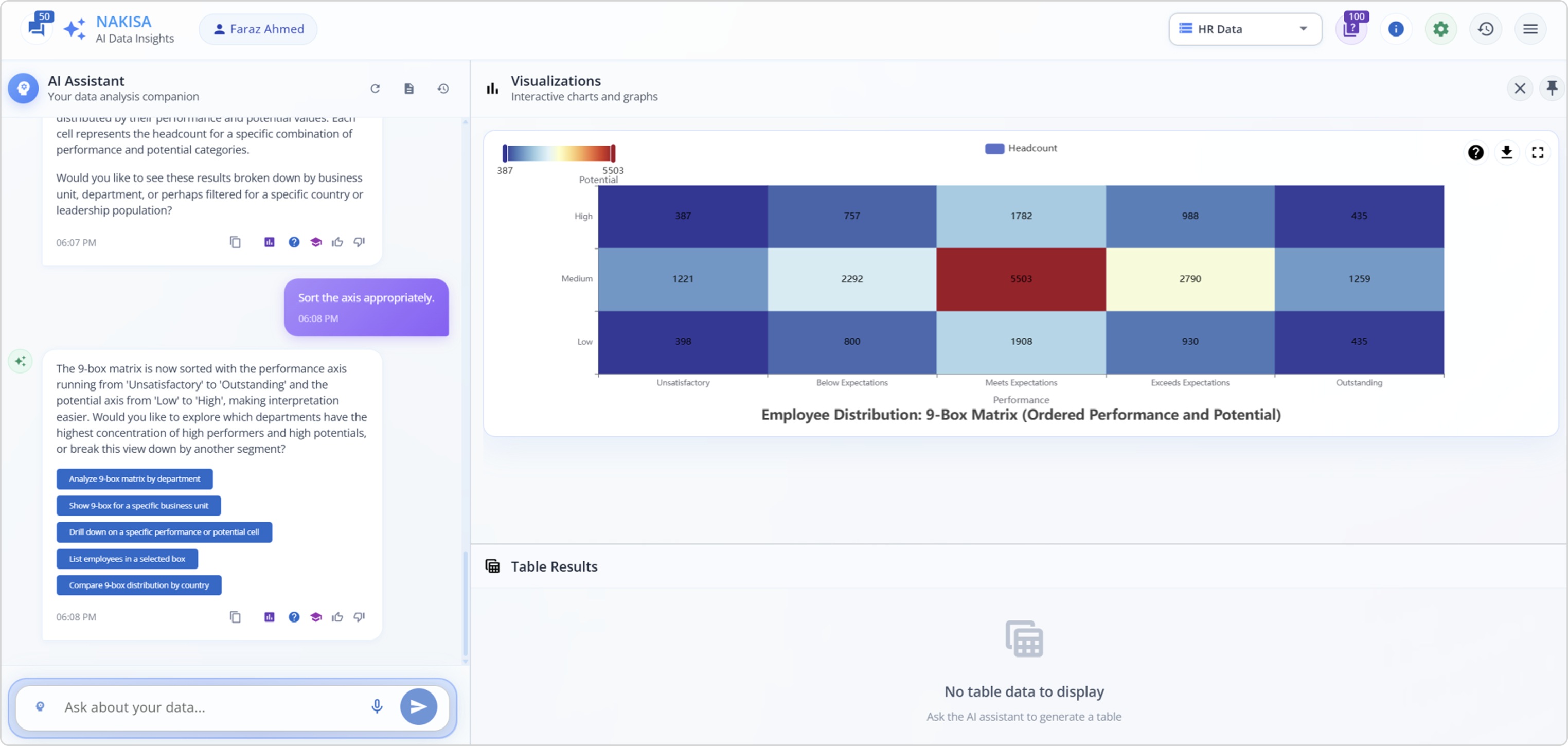
Since AI has a mind of its own, I asked AI to:
Sort the axis appropriately.
And yes, AI-powered drilldowns are available.
AI as a structural thinker
This time, we’re going further. Data isn’t always flat; it’s hierarchical, relational, multidimensional. That’s why this section is all about AI as a structural thinker: how Nakisa Decision Intelligence (NDI) connects the dots across currencies, stores, leases, projects, and work orders to reveal deeper insights.
Why this matters
- Complex made simple: Business data lives in webs of relationships, leases tied to stores, projects linked to milestones, subleases connected to financial flows. AI visualizations untangle the complexity.
- From slices to structures: Beyond basic charts, we have structural views like treemaps, networks, and heatmaps that show where the real business bottlenecks or opportunities lie.
- Decision acceleration: Seeing dependencies and trade-offs at a glance helps leaders act with confidence.
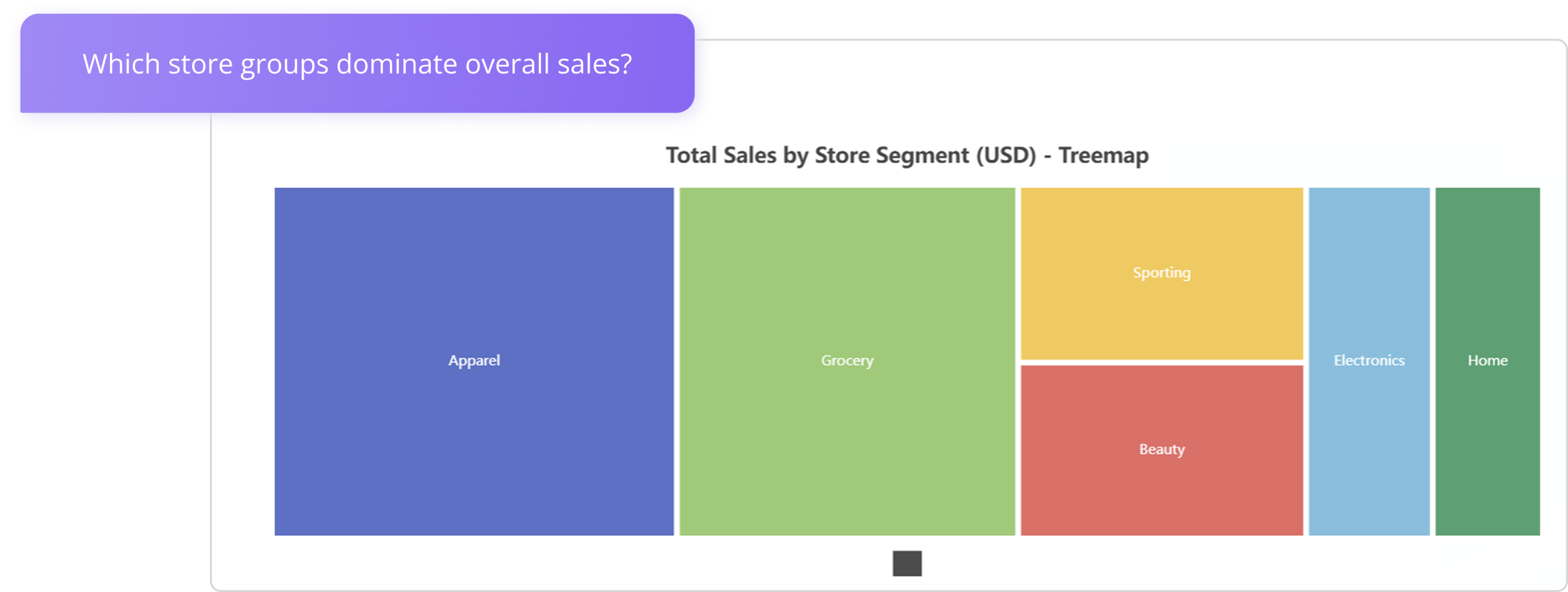
Treemap/sunburst showing hierarchical view of store performance
I asked NDI a series of questions using a dataset with real estate data.
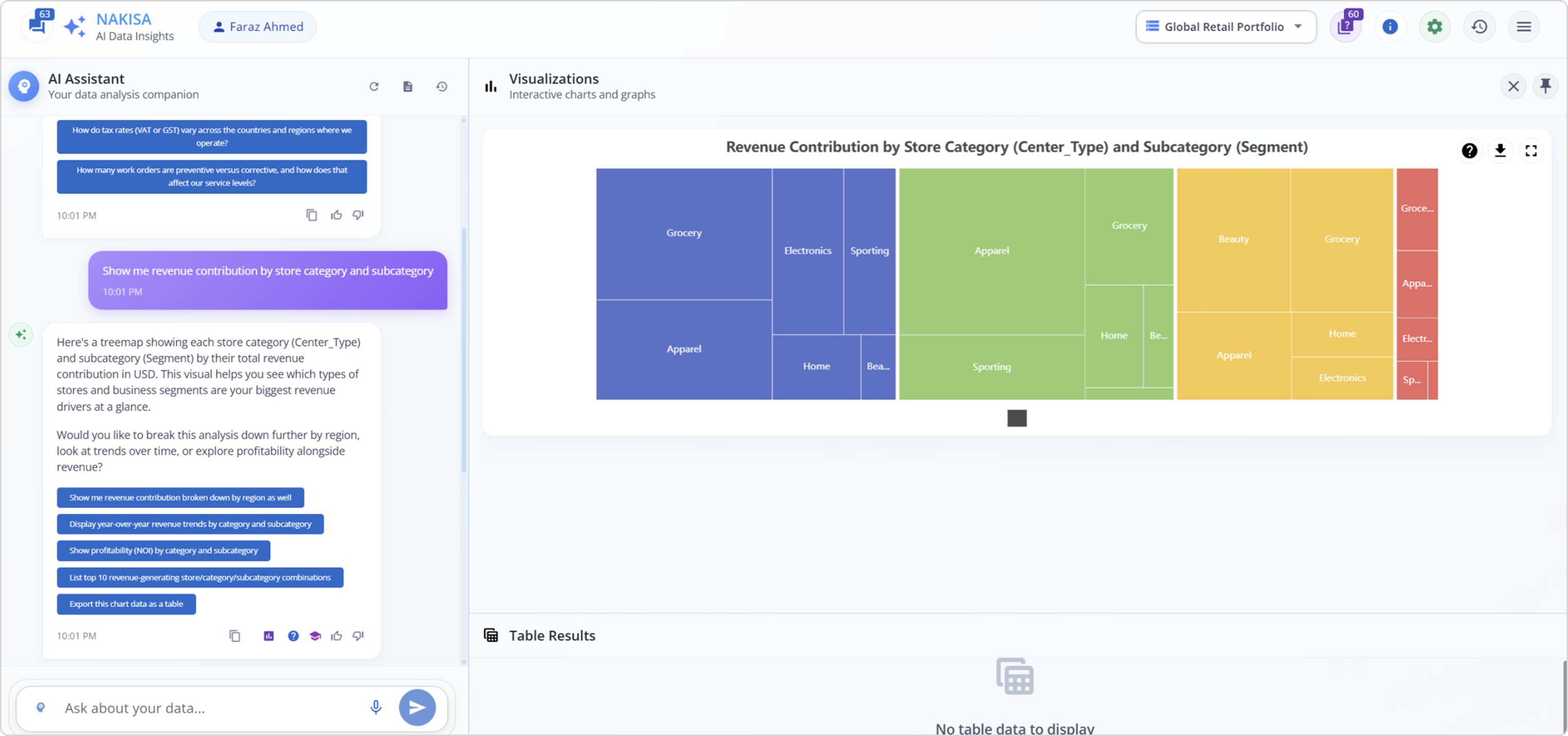
A structural look at store performance, one glance tells you which categories dominate revenue, and which ones barely move the needle.
Show me revenue contribution by store category and subcategory.
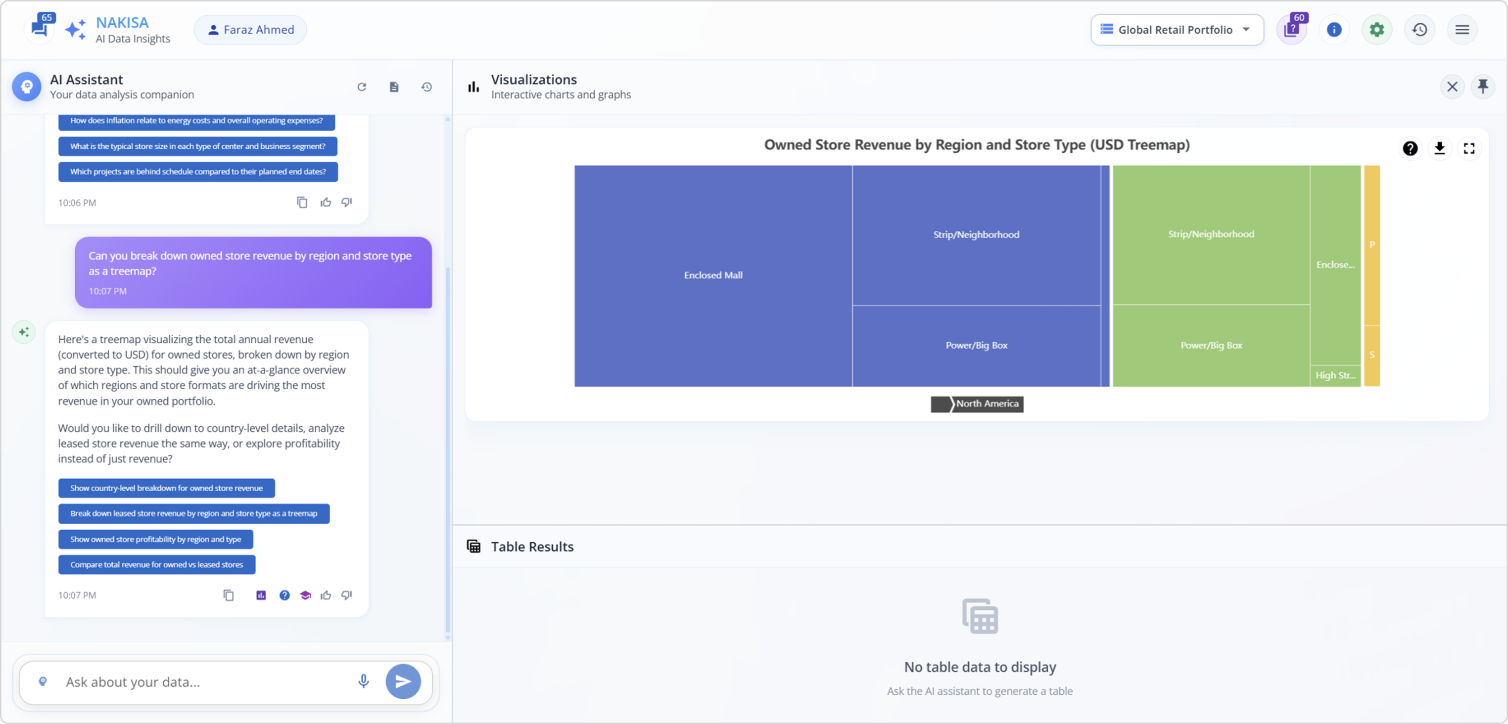
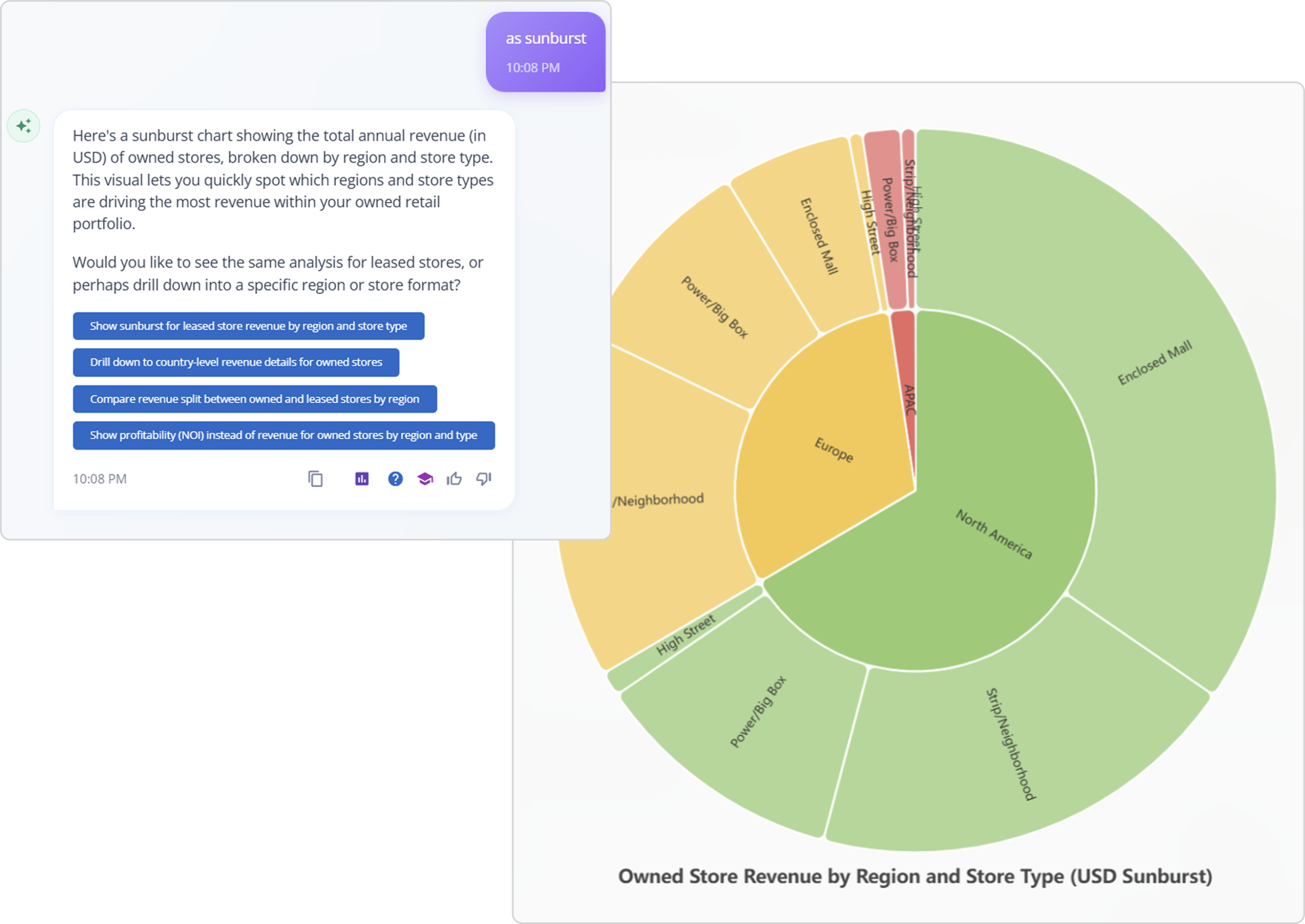
Can you break down owned store revenue by region and store type as a treemap?
Which store groups dominate overall sales?
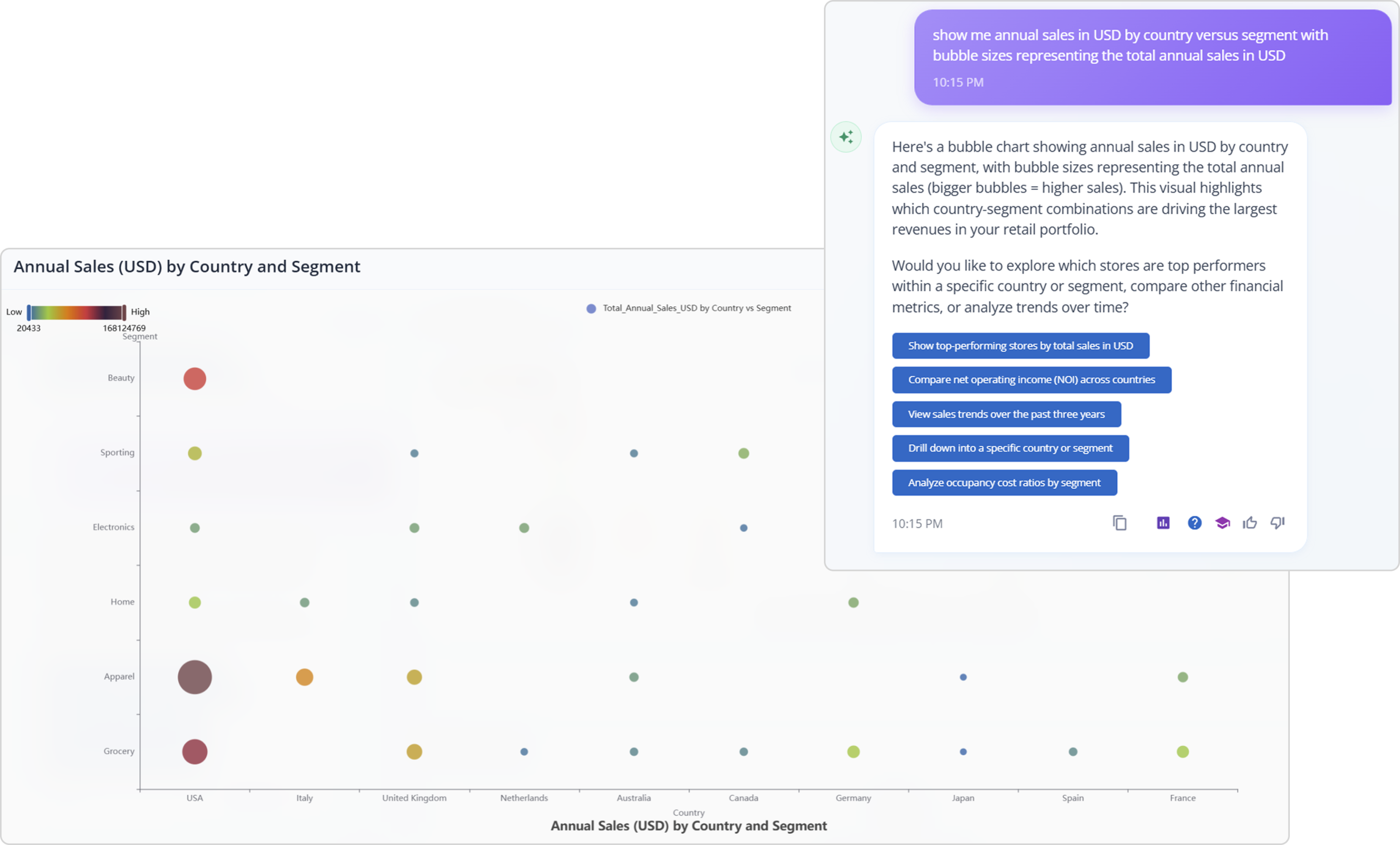
Bubble chart: sales analysis by country and segment
Exploring sales across countries and segments becomes instantly clearer with a bubble chart. The larger the bubble, the greater the sales impact, helping you spot leaders and laggards at a glance.
Show me annual sales in USD by country versus segment, with bubble sizes representing the total annual sales in USD.
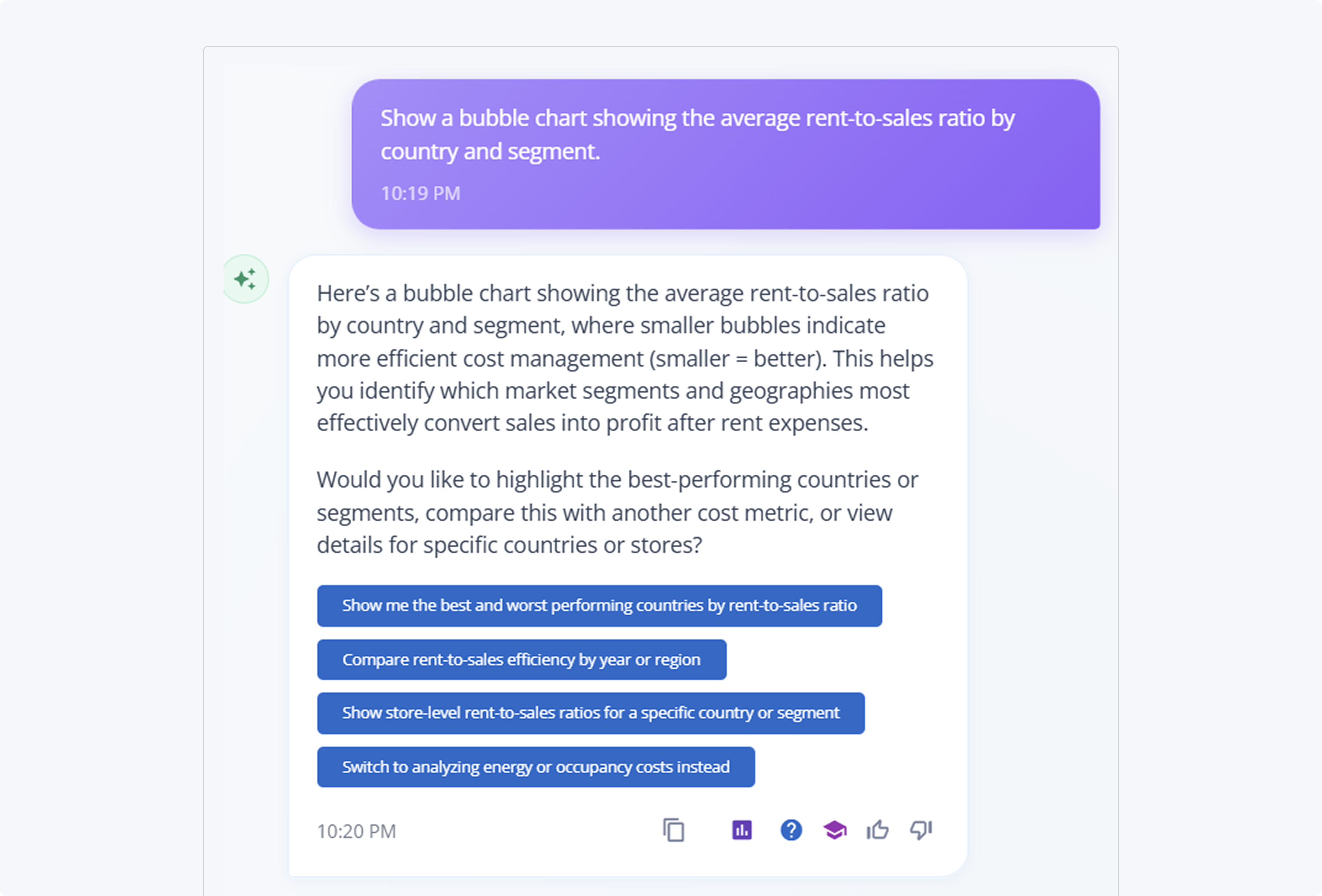
Bubble chart: rent-to-sales efficiency by country and segment
In this view, smaller bubbles signal greater efficiency, and a lower rent-to-sales ratio means stores are keeping more revenue after covering lease costs.
Show a bubble chart showing the average rent-to-sales ratio by country and segment.
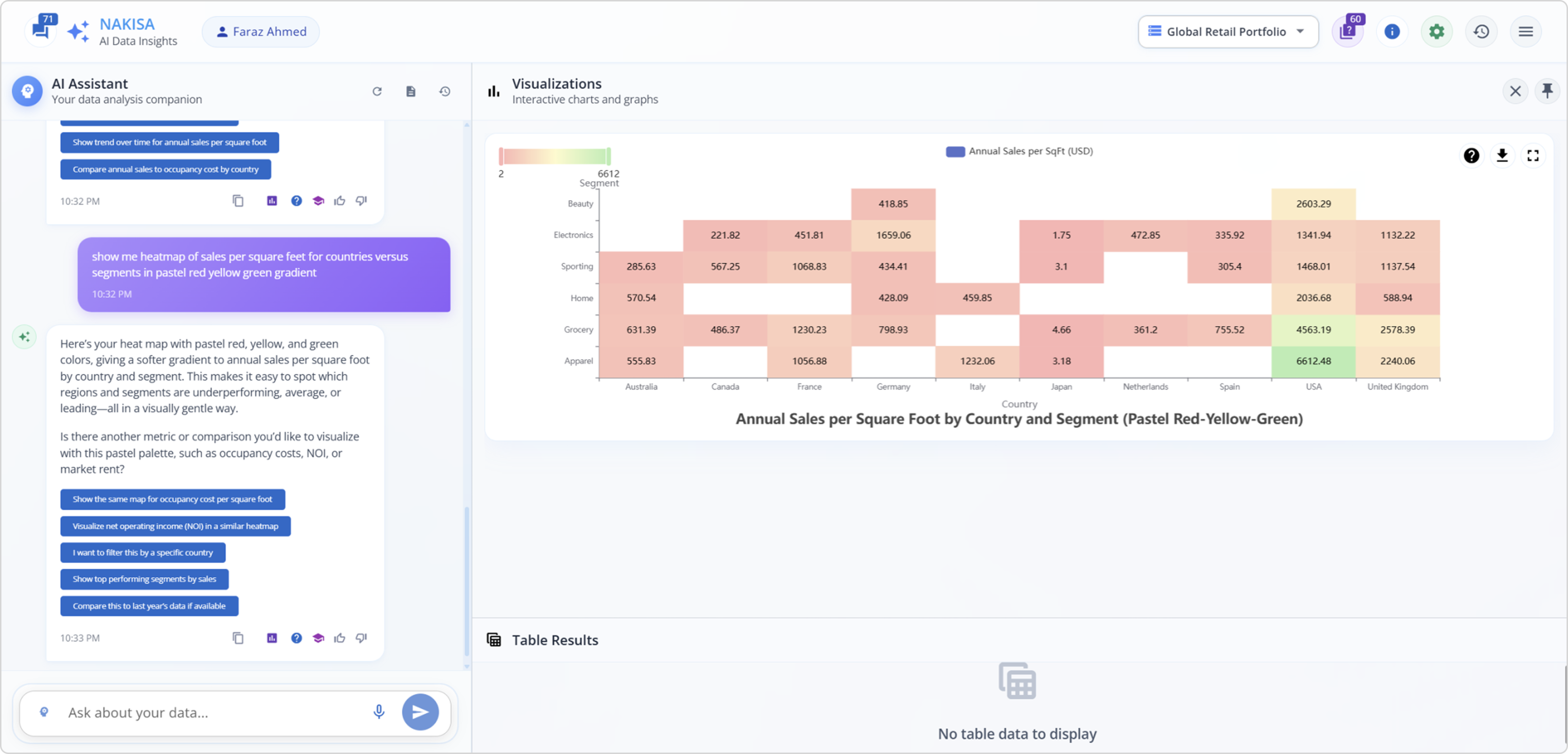
Heatmap for sales per square feet
Show me a heatmap of sales per square feet for countries versus segments in a pastel red, yellow-green gradient.
Yes! You can mention color schemes.
We’ve moved beyond “data as numbers” into “data as structures.” Nakisa Decision Intelligence doesn’t just answer questions; it connects relationships, uncovers hierarchies, and reveals multidimensional trade-offs in real time.
Chord charts: seeing relationships in action
Now, we step into multidimensional territory. Nakisa Decision Intelligence not only draws connections but also helps you compare, cluster, and analyze complexity across people, performance, projects, and markets.
Connection between departments and job roles by employee count
Show me the connection between departments and job roles by employee count.
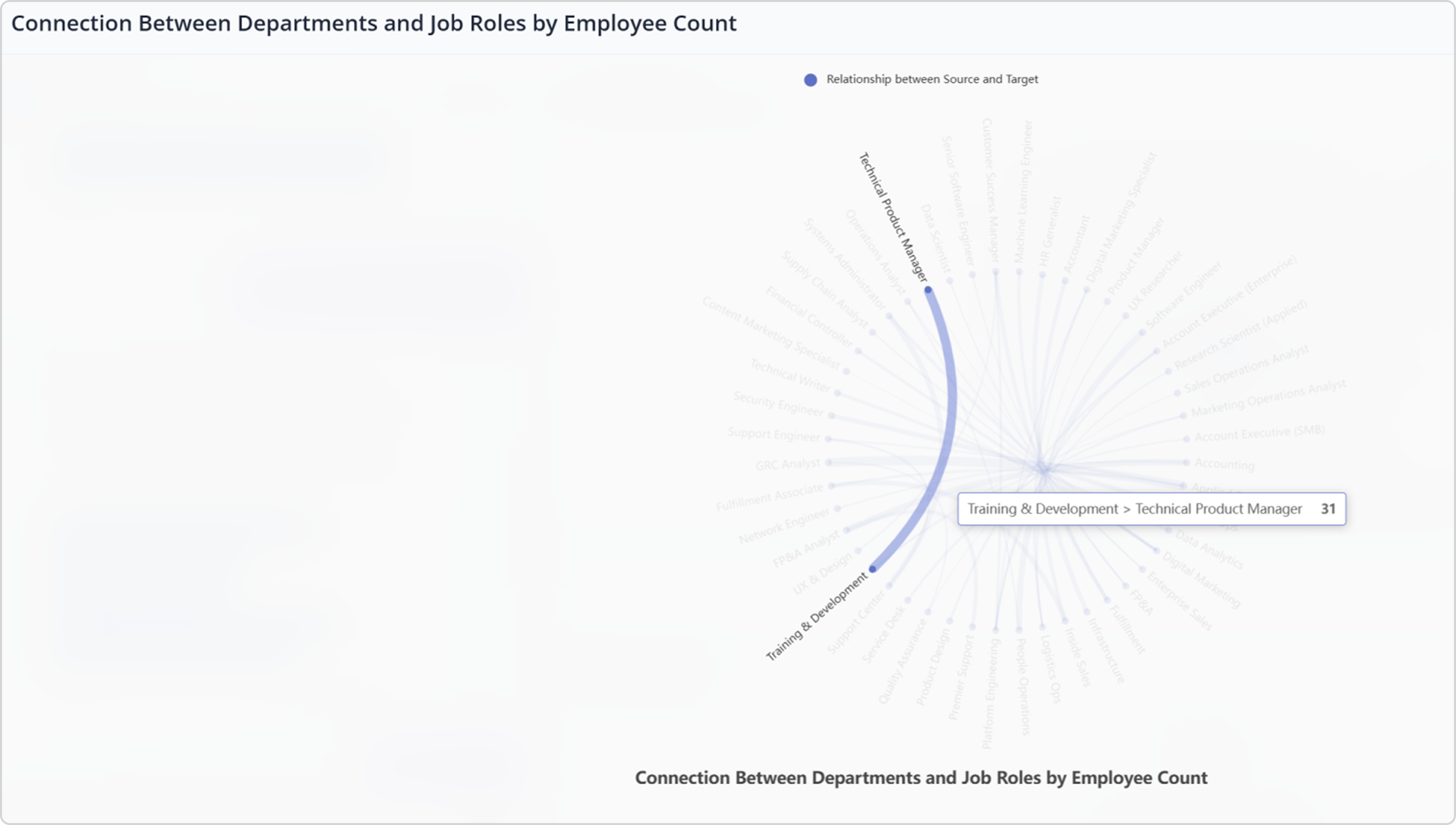
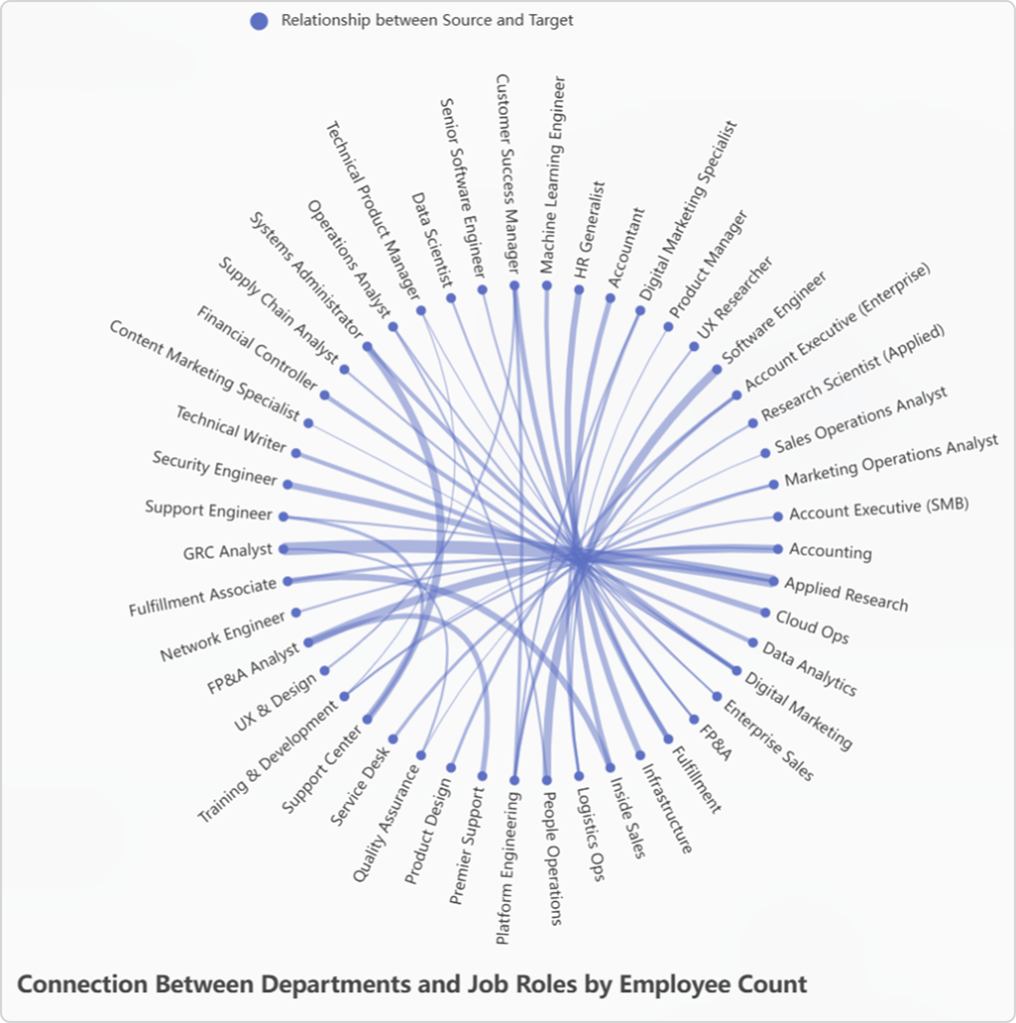
This chart reveals how different departments map to specific job roles. The density of the connections instantly highlights which roles are shared across multiple functions and which are more specialized. It’s an "at a glance" way to uncover organizational structure and talent dependencies.
Employee movement between performance categories over time
Show me employee movement between performance categories.
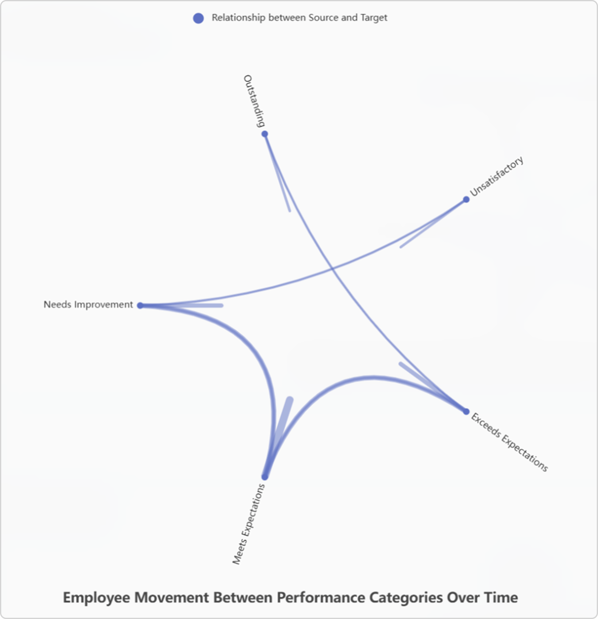
Performance reviews aren’t static. This visualization shows how employees move between categories like Meets Expectations, Exceeds Expectations, or Needs Improvement. By seeing flows, managers can spot positive development trends or identify where interventions may be needed.
3D scatter plots: unlocking multidimensional insights
Performance, potential, and risk of loss (employees)
Show me a 3D scatter plot of performance, potential, and risk of loss for employees.
This 3D scatter plot balances three critical dimensions: performance, potential, and risk of loss. Larger clusters reveal where organizations may be overexposed to attrition among top performers, while sparse areas show where talent development may be underutilized.
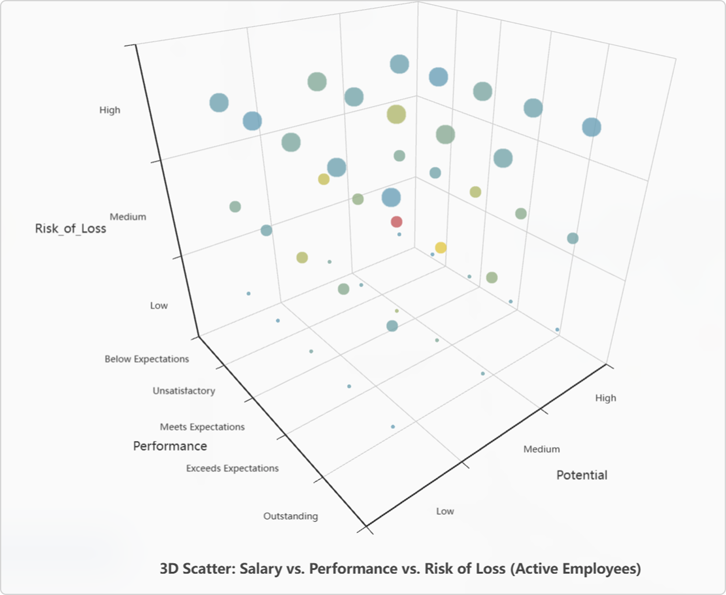
Salary vs. performance vs. risk of loss (active employees)
Show me a 3D scatter plot of salary vs. performance vs. risk of loss for active employees.
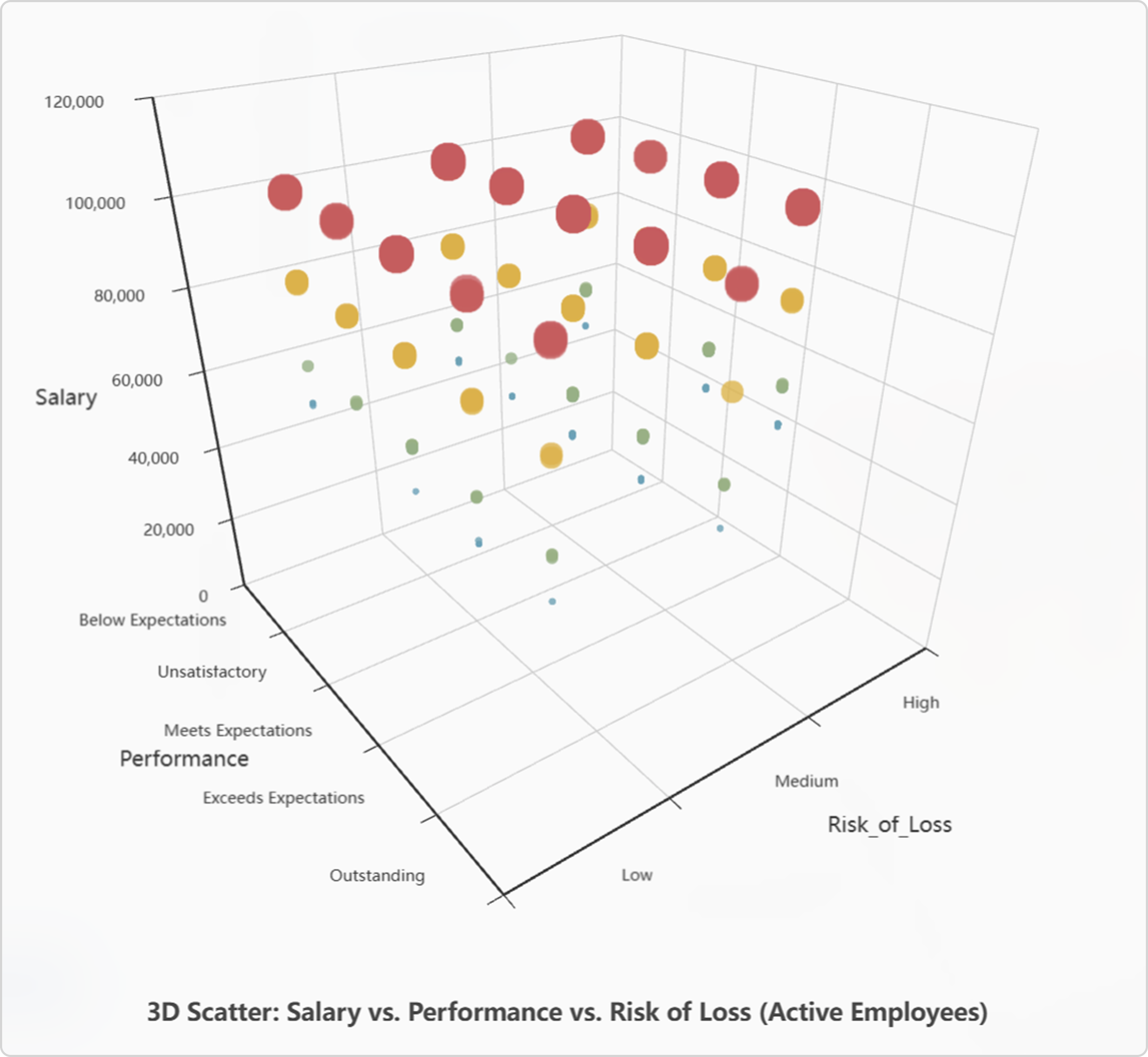
Salary alone doesn’t retain talent. By layering salary against performance and attrition risk, we can detect patterns like underpaid high performers at risk of leaving, or overcompensated low performers. This visualization arms leaders with data-driven insights for compensation strategies.
3D bar charts: comparing countries and categories
Total annual sales (USD) by country and segment
Show me total annual sales in USD by country and segment in a 3D bar chart.
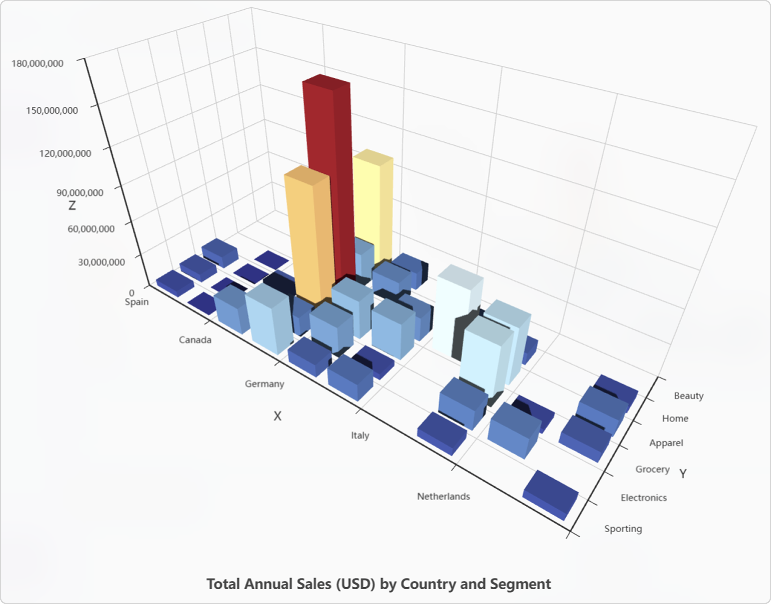
Not all countries or product segments contribute equally. This visualization shows which geographies dominate annual sales, and which product categories drive those results. Peaks signal market leaders, while valleys show opportunities for growth.
Total project capital expenditure (USD) by country and project type
Show me the total project capital expenditure in USD by country and project type in a 3D bar chart.
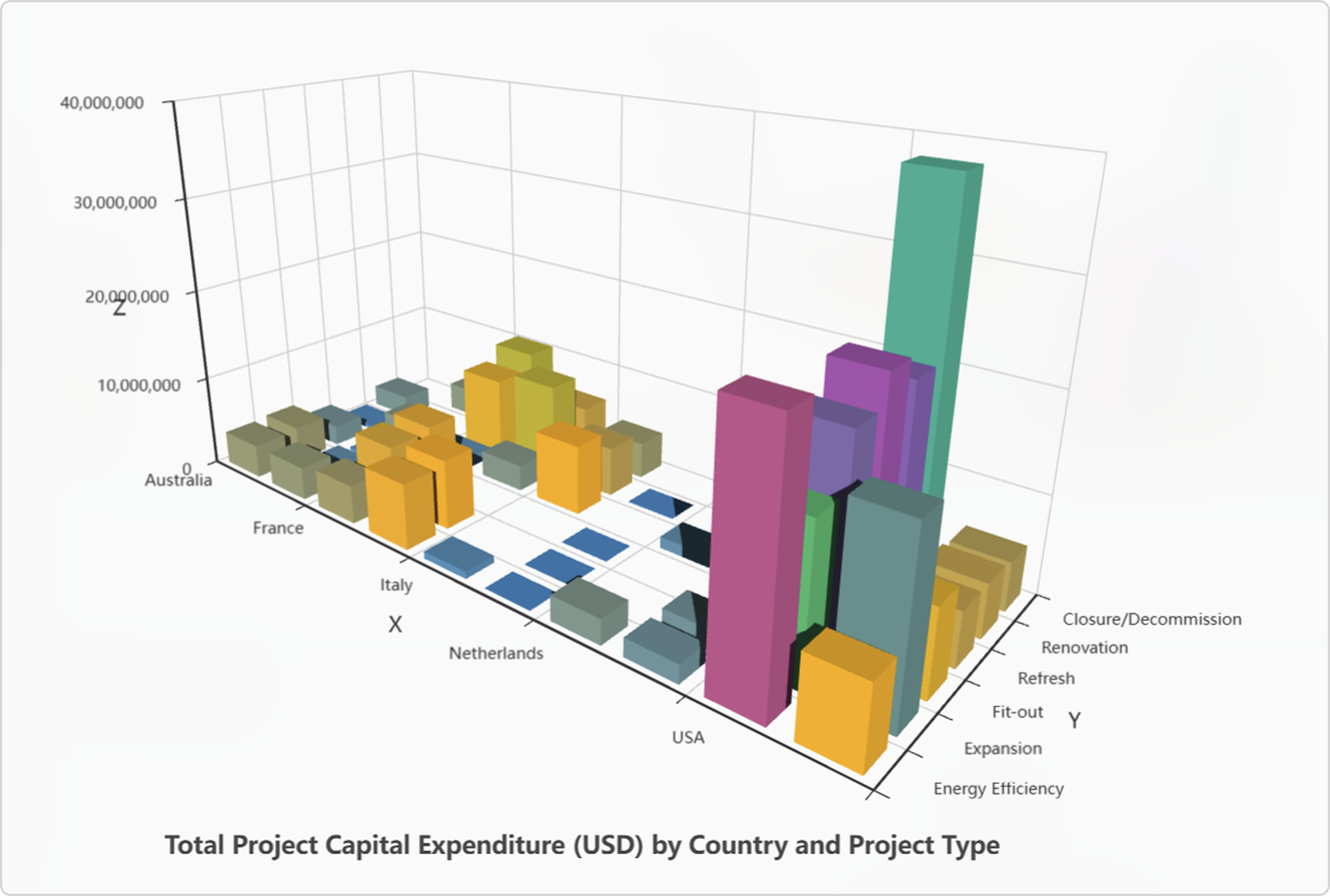
Capital expenditure isn’t just about the total spend, but where and how it’s deployed. This 3D view reveals which project types, like expansions, fit-outs, or renovations, drive investment across regions. Leaders can quickly see whether resources align with strategic priorities.
Boxplots: spotting outliers and variability
Employee salary distribution by business area (with outliers)
Show me the employee salary distribution by business area as a boxplot with outliers.
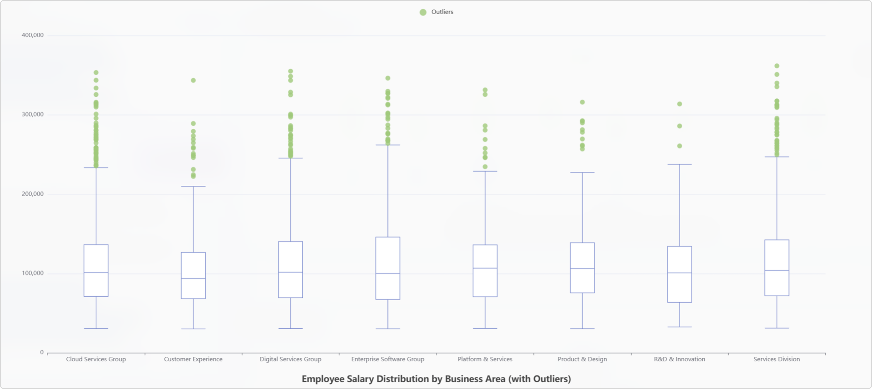
This boxplot surfaces salary distributions across business areas, highlighting not only medians and ranges but also outliers. Are some functions overpaying relative to peers? Do certain divisions show wider salary spreads that suggest inequity? These insights can inform HR policies.
Distribution of annual sales per SqFt by country (with outliers)
Show me the distribution of annual sales per square foot by country as a boxplot with outliers.
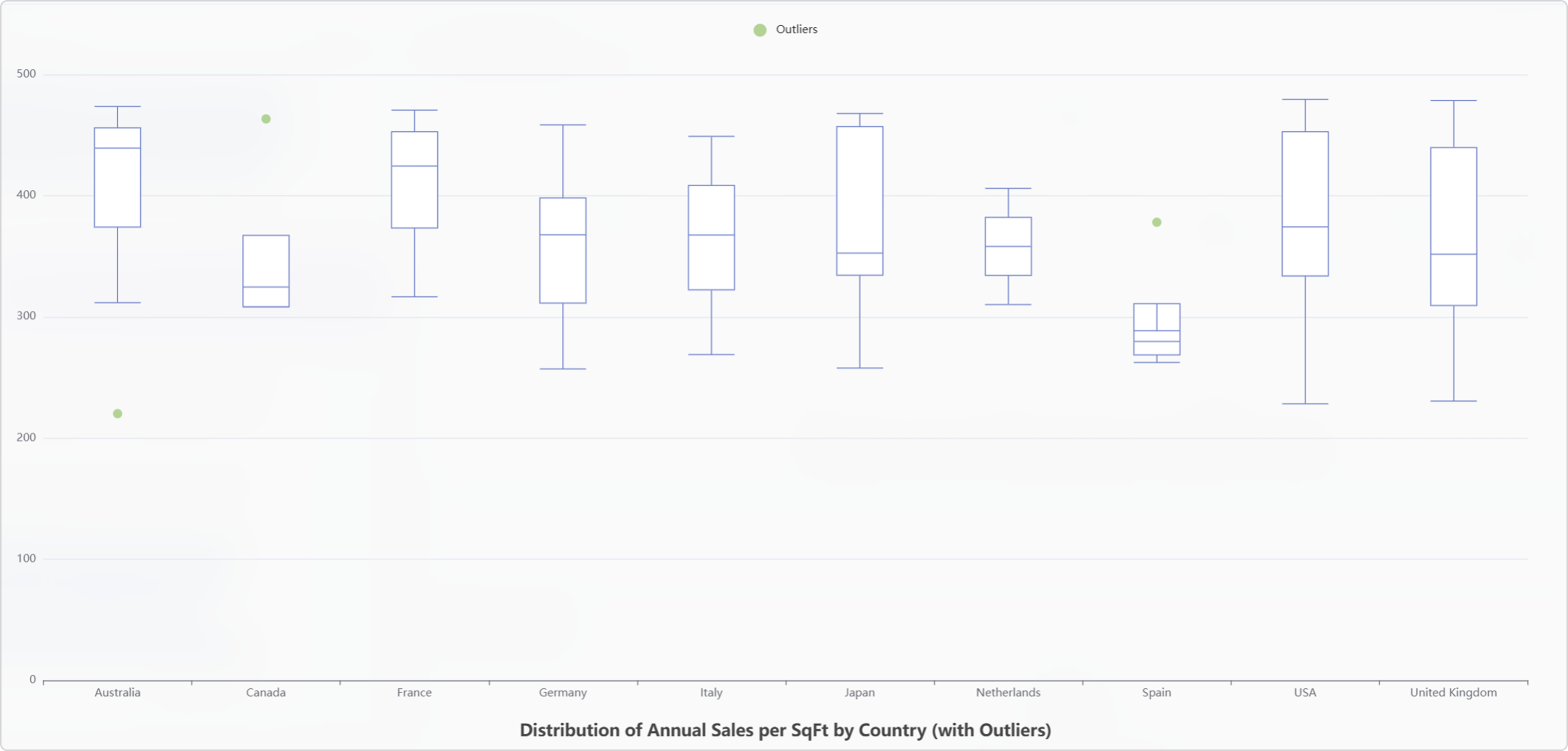
Sales per square foot is a core retail efficiency metric. By comparing across countries, this chart shows where space is used most productively and flags countries with underperforming or standout locations. Outliers reveal both risks and opportunities worth deeper investigation.
Network diagrams: unlocking hidden workforce insights
In a world where workforce dynamics are becoming increasingly complex, HR and business leaders are under pressure to connect the dots between skills, performance, job families, and organizational risk. Traditional dashboards show isolated metrics, but they rarely reveal the relationships behind the data.
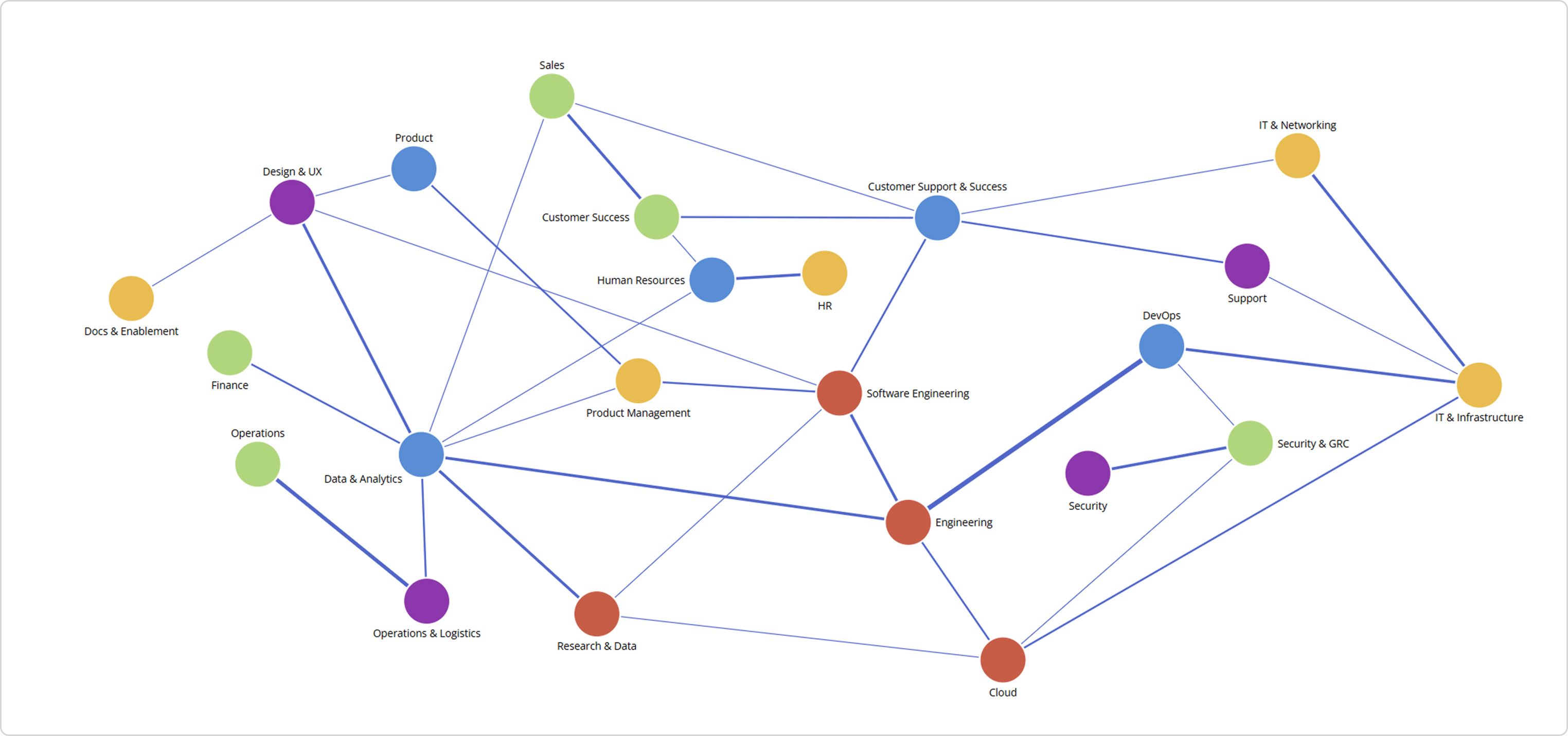
I asked NDI which skill categories are most required across departments.
Within seconds, multiple AI agents collaborate:
- The Planning & Orchestration Agent interprets the user’s intent.
- The Structured Data Retrieval Agent identifies relationships across the data model.
- The Graph / Charting Agent constructs a dynamic network diagram that makes complex relationships instantly clear.
What once required hours of SQL scripting and BI modeling now happens in real time, conversationally.
The network diagram above illustrates how different skill categories are distributed and interconnected across various departments within the organization. Each node represents either a department or a skill category, while the connecting lines (edges) indicate the number of job roles in each department that require that skill.
Thicker lines indicate a stronger dependency, meaning more roles within that department rely on that particular skill set.
We can go one step further and ask the system how the relevant tables and relationships are connected
How are the entities interconnected across this data model?
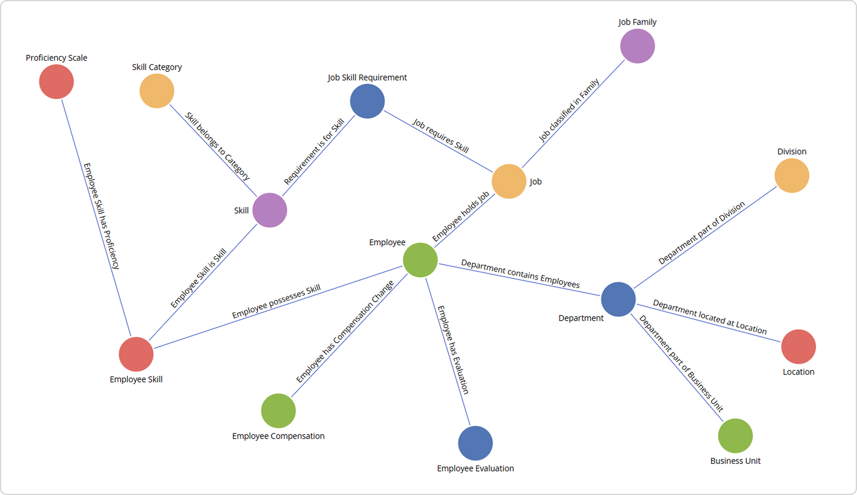
The diagram above represents part of the data model that was selected by AI to answer the question. It visualizes how key entities such as employees, jobs, skills, and departments are interconnected to form a unified view of organizational capability.
Revealing connections across the workforce
Below are selected examples from the Strategic Workforce Planning dataset illustrating how the platform translates analytical questions into intuitive visual networks and natural language insights.
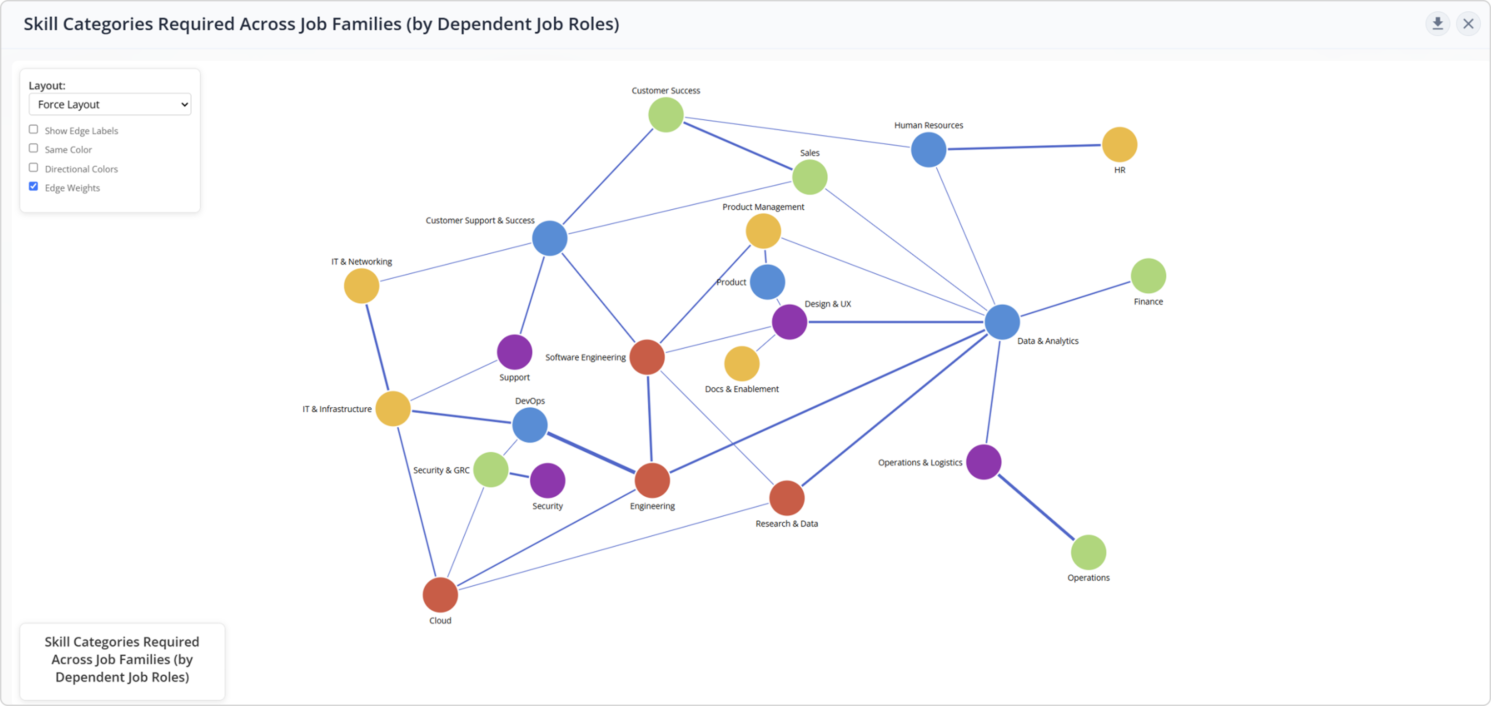
Which skill categories are most commonly required across job families, and how many job roles depend on each skill?
Here’s a network visualization showing how skill categories connect to job families based on the number of job roles, depending on each skill. Larger edges indicate more roles requiring that skill within a family.
Notable insights include:
- DevOps skills dominate in Engineering.
- Marketing skills are central to Marketing.
- Operations skills anchor Operations & Logistics.
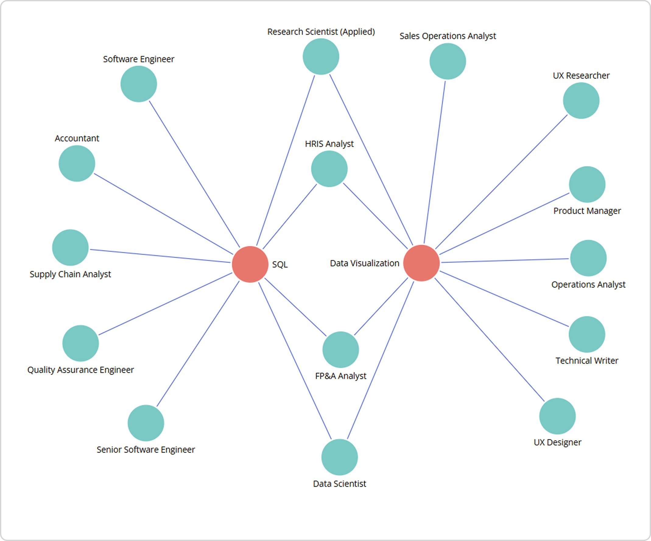
Then I asked, show me how SQL and Data Visualization skills are connected to jobs.
NDI instantly creates a network chart that demonstrates how SQL and Data Visualization skills interlink with multiple job roles. Each edge represents a job where that skill is required.
Insights include:
- Data Scientist, FP&A Analyst, Research Scientist (Applied), and HRIS Analyst roles rely on both SQL and visualization skills.
How are departments and job families connected based on the number of employees? Show top connections.
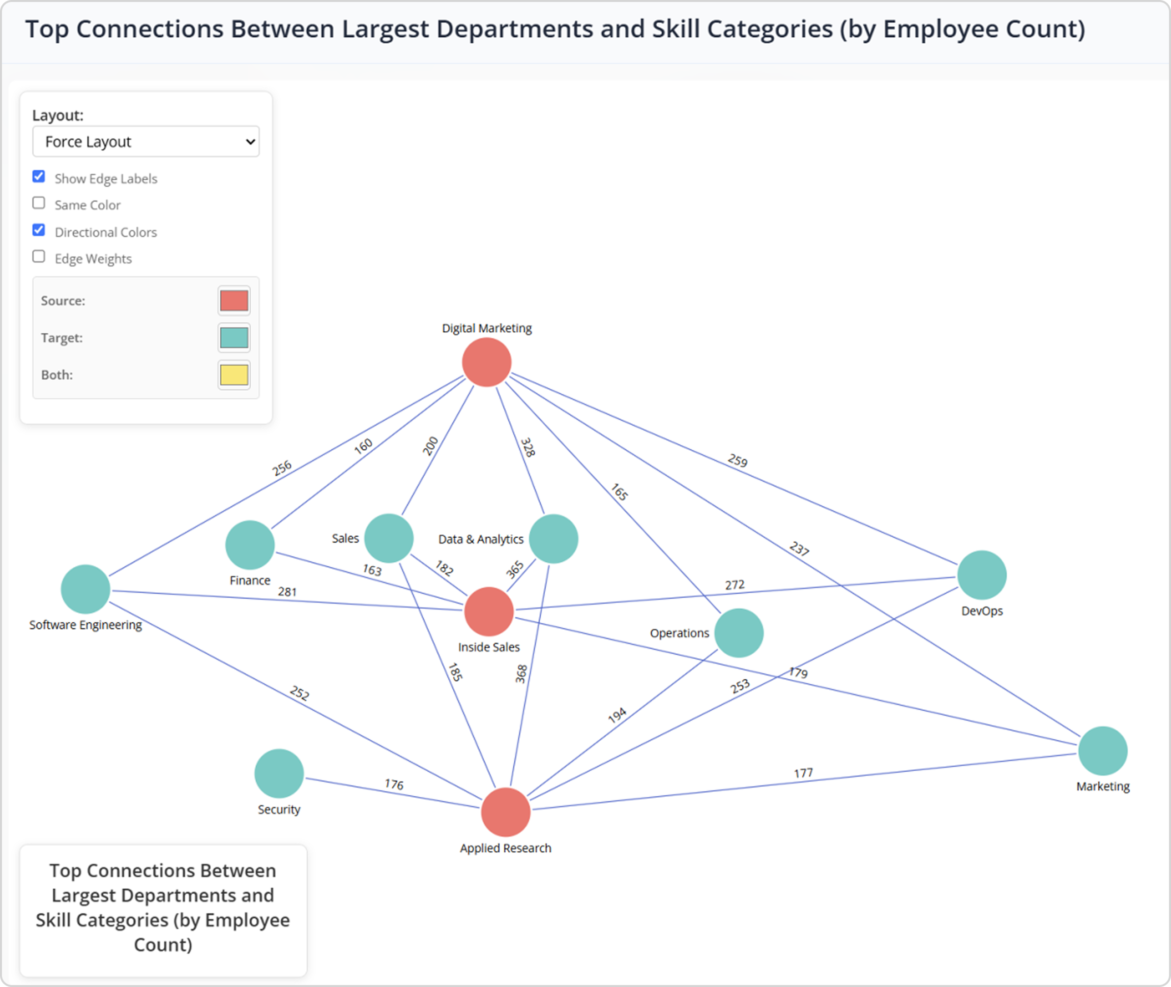
This network diagram highlights the strongest connections between major departments and job families, based on the number of employees they share.
The visualization reveals not only the structural relationships across the workforce but also a few data quality issues worth noting. For instance, Applied Research appears highly connected to both Sales and Operations, an unusual pattern that could indicate role misclassifications or inconsistent job-family tagging within the dataset.
By exposing both organizational linkages and data integrity gaps, this visualization demonstrates how the Decision Intelligence Platform helps users not only understand workforce dynamics but also identify opportunities to improve data accuracy and governance.
How do departments’ average risk-of-loss scores evolve over time, and which show upward or downward trends?
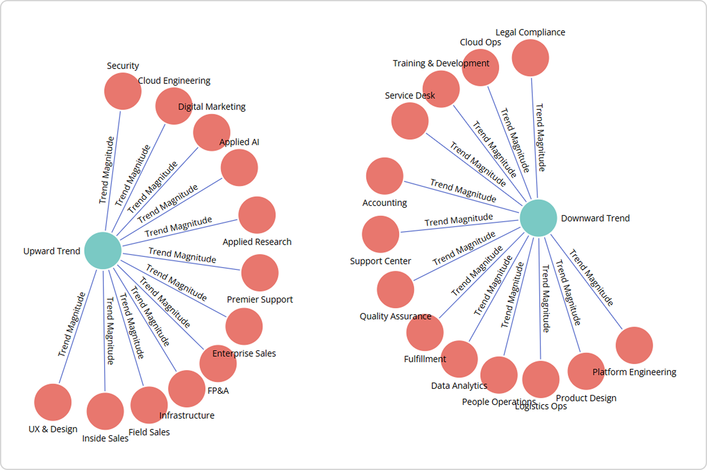
This network diagram visualizes how department average risk-of-loss scores have evolved, highlighting which areas show upward or downward trends over time.
On the left, departments such as Security, Cloud Engineering, Digital Marketing, and Applied AI are linked to upward trends, indicating an increasing risk of employee loss, often signaling retention or engagement challenges. On the right, departments like Data Analytics, Quality Assurance, and Product Design exhibit downward trends, suggesting improved stability or reduced attrition risk.
Read the full blog on how to unlock workforce insights with the Nakisa Decision Intelligence Platform and why it matters in today’s organizations here.
What’s Next?
With chord charts, 3D scatter plots, bar charts, and boxplots now part of the conversation, Nakisa Decision Intelligence is moving beyond simple data storytelling into multidimensional strategy analysis.
From connections to comparisons, from flows to outliers, Nakisa Decision Intelligence consistently surfaces the insights that matter most, intuitively, interactively, and in real-time.
Conclusion
In this blog, we looked at how Nakisa Decision Intelligence (NDI) is transforming the way organizations turn information into fast, confident action, through AI-guided exploration, natural-language interaction, and live visualizations.
But that’s just the beginning. In my next blog, I’ll dive deeper into other key capabilities of the platform, including what-if scenario simulations, forecasting, its architecture, the dynamic UI engine, and more. I often write about AI and Nakisa innovations. Connect with me on LinkedIn for the latest updates!
You can request a demo of NDI here, or reach out to your dedicated Client Success Manager to access the preview environment.